Known But Not Chosen: How Brands Become the Obvious Choice
Known But Not Chosen: How Brands Become the Obvious Choice
Most businesses don’t have an awareness problem. They have a choice problem.
Your audience has seen your ads. They follow you on Instagram. They’ve visited your website, perhaps more than once, and some of them have signed up to your newsletter. By any traditional measure, your brand is doing its job. And yet, when the moment comes to buy, book or sign, they choose someone else. Or they ask for a discount. Or they simply don’t decide at all.
This is the gap between being known and being chosen, and it’s where a surprising amount of marketing budget quietly disappears. Visibility can be bought. Preference has to be built. In this article, we look at what separates the brands people recognise from the brands people actively choose, and at three very different businesses that have turned that difference into a commercial advantage.
The expensive gap between known and chosen
When growth stalls, the instinct is usually to turn up the volume: more ads, more posts, more content, more spend. But if your audience already knows who you are, more exposure rarely changes their decision. It just reminds them that you exist, alongside every other option they’re weighing up.
The real question isn’t “Do people know us?” It’s “When people compare us, why would they pick us?”
If you can’t answer that in a sentence, your customers can’t either. And when customers can’t see a meaningful difference between options, they default to the easiest deciding factor available, which is almost always price.
Preferred brands escape that trap. Customers arrive with their minds half made up. They compare less, question less and haggle less. They come back, and they bring other people with them. That doesn’t happen by accident, and it rarely happens through a single campaign. It’s the result of strategic decisions about who the brand is for, what it stands for, and how every part of it is experienced.
What makes a brand the obvious choice?
In our work with businesses across sectors, from aesthetics clinics to professional services, we see the same five foundations behind brands that customers choose without hesitation:
- Positioning: a clear, distinctive place in the customer’s mind that competitors can’t easily claim.
- Emotional relevance: a reason to care that goes beyond features and price.
- Credibility: proof, expertise and results that make choosing you feel like a safe decision.
- Experience: every touchpoint, from website to reception desk, reinforcing why you’re worth it.
- Consistency: showing up the same way, everywhere, until your brand becomes instantly recognisable.
None of these is a tactic on its own. They are strategic choices that shape everything a brand does. The best way to understand how they work is to see them in action, so let’s look at three brands that have each mastered a different route to preference.
Positioning: How Liquid Death made water worth choosing
Few categories are harder to stand out in than bottled water. The product is essentially identical from brand to brand, and the category’s visual language is well established: blue labels, mountain springs, words like “pure” and “natural”. For decades, water brands have competed on price, distribution and minor claims about minerals.
Liquid Death ignored all of it.
It put still mountain water into a tallboy can that looks more like a craft beer or an energy drink, wrapped it in heavy-metal skull artwork and gave it the tagline “Murder your thirst.”
Its sustainability message, that aluminium cans are a better alternative to single-use plastic, is delivered under the rallying cry “Death to plastic” rather than in the earnest tone most eco brands adopt. Its social channels lean into dark humour, fake metal albums and absurd merchandise.
What makes this so instructive is that Liquid Death didn’t improve the product. It changed what the product meant. By positioning water as something rebellious, funny and a little bit dangerous, it created a brand that people choose on sight, and choose for what it says about them. Holding a can of Liquid Death at a gig or a festival is a statement. Holding a generic bottle of water isn’t.
Why it works:
- It breaks the category’s visual rules so completely that it can’t be mistaken for anything else on the shelf.
- It gives people a reason to choose it that has nothing to do with price.
- It knows exactly who it’s for, and it’s comfortable not appealing to everyone.
- Its personality is consistent across packaging, social media, merchandise and partnerships.
The Designmc takeaway:
If your category looks and sounds the same, that’s not a limitation. It’s an opportunity.
Most businesses describe themselves using the same words as their competitors, so customers can’t tell them apart. A sharp position is a deliberate choice about who you are for, what you stand for and how you want to be seen, and it’s the foundation everything else is built on.
You don’t need skulls on your packaging. You do need to know what makes you the only sensible option for the customers you most want to attract, and to express it with confidence.
Experience: How Aesop turns every touchpoint into a reason to return
Aesop sells skincare, hand wash and fragrance: products available in countless forms from countless competitors. Yet the brand commands premium prices and fierce loyalty, and much of that comes down to experience.
Aesop is famous for the fact that no two of its stores are alike. Rather than rolling out an identical template across the world, each store is designed in response to its location, often in collaboration with local architects and using materials that reflect the neighbourhood, from reclaimed timber to local stone.
One store might feel like an apothecary, another like a gallery. And yet every one is unmistakably Aesop, through its restrained palette, its signature amber bottles, its generous sinks where customers are invited to try products, and its calm, unhurried service.
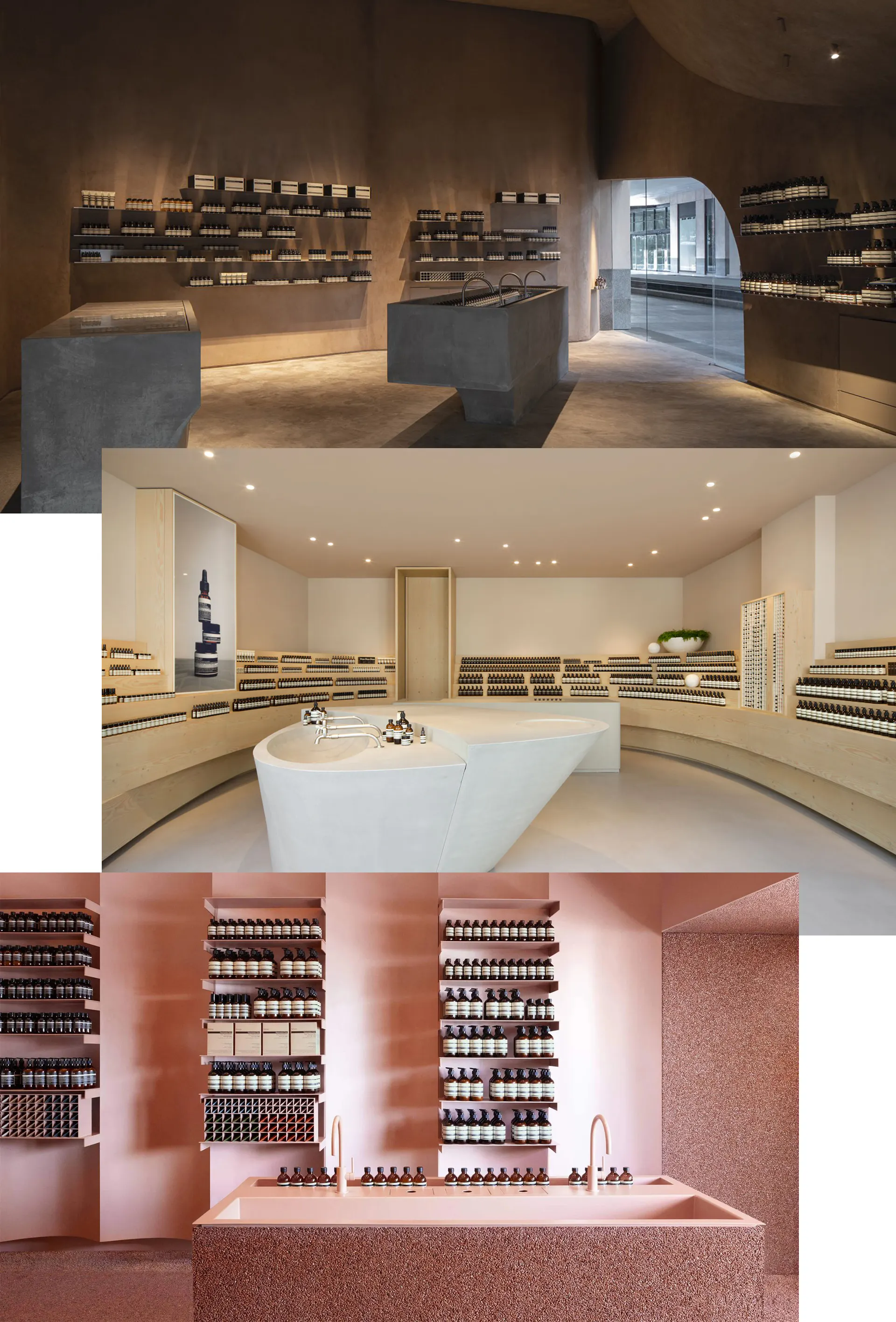
That consistency of feeling runs well beyond the stores. The website, packaging, product descriptions and even the literary quotes woven into the brand’s communications share the same considered, intelligent tone.
Customers aren’t simply buying a hand wash.
They are buying into a sensory, thoughtful experience that feels different from the rest of the high street.
Why it works:
- It treats the physical environment as part of the brand, not simply a place to sell.
- It combines local character with a globally consistent identity, so every visit feels special but familiar.
- It invites customers to touch, try and linger, which turns browsing into a ritual.
- Its tone of voice is as distinctive and considered as its interiors.
The Designmc takeaway:
This is especially relevant for clinics, salons, studios and any business where clients visit in person.
Your treatment room, your reception, your booking process, your follow-up email and your website are all part of the product, whether you’ve designed them that way or not. Clients use these moments to judge whether you’re worth the price, often before they’ve experienced the service itself.
When every touchpoint feels considered and coherent, the experience itself becomes a reason to choose you, and a reason to come back.
Community: How Gymshark66 turned customers into the marketing
Gymshark began as a small UK operation and has grown into one of the best-known names in fitness apparel. A big part of that story is community, and one of the clearest examples is Gymshark66.
Every January, when motivation is high and New Year’s resolutions are fresh, Gymshark invites its audience to commit to a positive habit for 66 days. The number is drawn from research at University College London into how long it takes, on average, for a new behaviour to become automatic. Participants choose their own goal, whether that’s training, running, eating better or something entirely different, and share their progress on social media using #gymshark66.
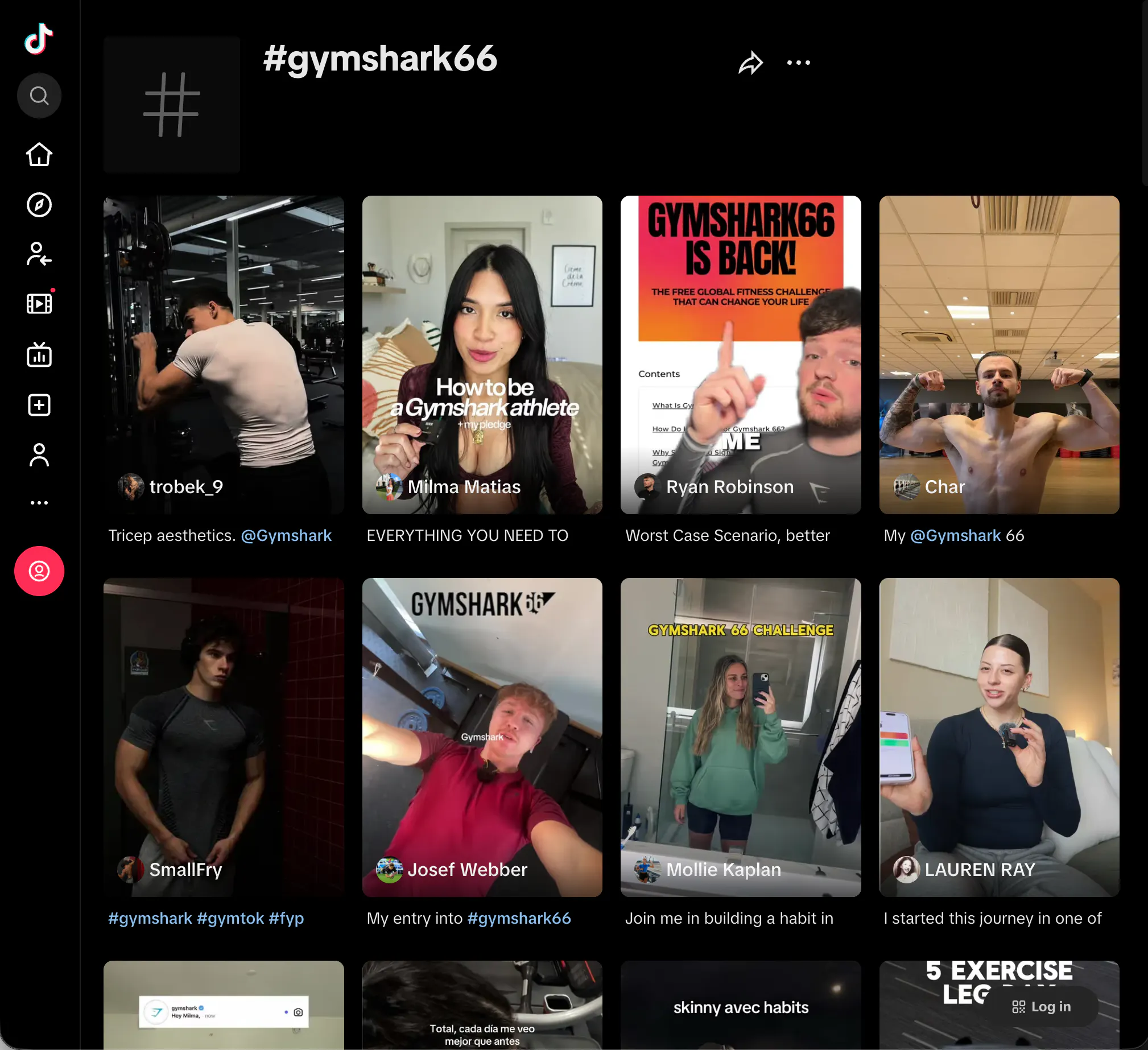
The result is a wave of real people posting their day-one videos, their mid-point struggles and their day-66 transformations. Gymshark provides the framework and encouragement, but the content, the stories and the momentum come from the community itself.
The brand becomes associated not with a product, but with personal progress, and with a community of people who are pushing themselves alongside you.
Why it works:
- It gives customers an active role, not just a sales message.
- It taps into a genuine moment of motivation rather than inventing one.
- It creates a steady stream of authentic, customer-made content that no ad budget could replicate.
- It builds a sense of belonging, which is one of the strongest drivers of loyalty.
The Designmc takeaway:
Community doesn’t require millions of followers. It requires giving people a reason to take part.
For a clinic, that might be a skin-journey programme that celebrates client progress.
For a professional services firm, it might be an events series or a peer network.
When customers feel part of something, choosing a competitor stops being a simple switch. It means leaving a group they belong to.
What these brands have in common
On the surface, a canned water brand, a skincare retailer and a fitness apparel company have very little in common. But look beneath the creative work and the pattern is the same.
None of them won preference through louder advertising. Each made a clear strategic decision first: Liquid Death decided who it was for and what it stood against; Aesop decided that experience would be its point of difference; Gymshark decided that its customers’ progress mattered more than its products. The identity, the content, the environments and the campaigns all followed from those decisions.
This is the part that most businesses skip. They jump straight to a new logo, a new website or a new campaign without first answering the harder questions about positioning and purpose. The result is marketing that looks good but doesn’t change behaviour. The brands people choose are built the other way round: strategy first, creativity in service of it, and consistency to make it stick.
Five questions to ask about your own brand
If you suspect your business is known but not chosen, these questions are a useful place to start:
1: If a customer compared you with your three closest competitors, what would make you the obvious choice, and would they be able to see it?
2: Does your brand sound and look like everyone else in your sector, or does it stand for something distinct?
3: Which touchpoints in your customer journey feel considered, and which feel like an afterthought?
4: Do your customers have any reason to feel part of your brand beyond the transaction?
5: Is your brand expressed consistently across your website, social media, premises and communications?
If any of these answers are uncomfortable, that’s a good thing. It means there is a clear opportunity to close the gap between being known and being chosen.
Let us help you make your brand the obvious choice
At DesignMC, we help ambitious business owners build brands that customers actively choose.
We start with strategy, working with you to define your positioning, understand your customers and uncover what makes you genuinely different. Then we bring it to life through brand identity, websites, digital experiences and marketing that work together, so every touchpoint gives people another reason to pick you.
Give our team a call 01926 754038 or drop us an email at hello@designmc.org
LET’S TALK
Looking to evolve your brand, transform your website, strengthen your marketing or build smarter digital infrastructure around your business? Drop us an email at hello@designmc.org or give us a call direct on 01926 754038 for an informal chat.