
Premium by design: Six visual principles that elevate a brand
In a market shaped by rising costs and cautious spending, customers are choosing more carefully than ever. They’re not simply buying products - they’re investing in brands that feel worth it.
Premium today isn’t defined by price point. It’s defined by perception.
And perception is built - first and foremost - through design.
Premium brands don’t shout about value. They demonstrate it through restraint, clarity and confidence. They understand that visual language communicates before a single word is read.
In this article we share the six design principles that consistently signal quality, confidence and long-term value.
Why Premium Perception Matters
Even in uncertain markets, customers will still spend - but only where they see alignment between cost and experience.
Premiumisation is not about pretending to be luxury. It’s about elevating perceived value through:
- Clarity of positioning
- Sophistication of design
- Confidence in execution
- Consistency across every touchpoint
When design feels intentional, customers assume the business behind it is too.
Six Visual Signals of a Premium Brand
1. Space Is Strategy
Premium brands understand that space is not emptiness - it’s confidence.
Minimal, considered layouts allow content to breathe. They remove urgency, reduce noise and eliminate visual pressure. Where discount brands compete for attention, premium brands curate attention.
Every element must earn its place.
Whitespace creates:
- Focus
- Elegance
- Authority
Restraint communicates value.
2. Typography as Tone of Voice
Type is not decoration. It is personality in structural form.
Premium typography feels balanced, deliberate and calm. It avoids novelty and excess. It respects spacing, hierarchy and rhythm.
Limiting your brand to one or two well-selected typefaces creates cohesion. Proper kerning, generous leading and disciplined hierarchy elevate even the simplest message.
Well-set type says: we care about the details.
3. A Controlled Colour Narrative
Colour is emotional shorthand.
Premium palettes are rarely loud or crowded. They are refined, edited and intentional. Neutrals, earthy tones and deep monochromes signal maturity and confidence.
Accent colours, when used sparingly, become powerful rather than overwhelming.
The key isn’t which colours you choose - it’s how tightly you control them.
Premium brands design systems, not mood boards.
4. Graphic Language with Discipline
Icons, emblems, textures and graphic devices must feel curated - not collected.
Premium brands avoid randomness. They develop a distinctive visual language and apply it consistently. Simplicity beats embellishment. Structure beats decoration.
Every graphic element should support clarity - never distract from it.
Design maturity is shown through discipline.
5. Editorial-Level Photography
Premium brands don’t rely on generic visuals.
They invest in photography that feels art-directed, cohesive and intentional. Lighting is controlled. Composition is thoughtful. Cropping feels editorial rather than commercial.
Consistency across imagery creates immersion.
The goal isn’t to show everything - it’s to show the right things, beautifully.
6. Quiet Consistency
Premium whispers.
It does not rely on one dramatic moment. It relies on consistent execution across every touchpoint - website, social, packaging, email, signage.
Brand rules are not restrictive; they are what build trust. The more consistent the system, the stronger the perception of quality.
Confidence is repetitive.
Beyond Visuals: Designing the Entire Experience
Premium design extends beyond aesthetics.
It lives in:
- Effortless UX and frictionless journeys
- Clear, intelligent messaging
- Thoughtful micro-interactions
- Personalised service that feels concierge-level
If a brand looks refined but functions poorly, perception collapses.
Premium must be felt - not just seen.
Brands Executing Premium Well
TOTEME
From the first click, TOTEME feels editorial rather than transactional - and that distinction is the point. The brands website behaves like a curated fashion title: paced, spacious, and intentionally restrained. Instead of trying to “convert” you with urgency, it builds desire through composure and control.
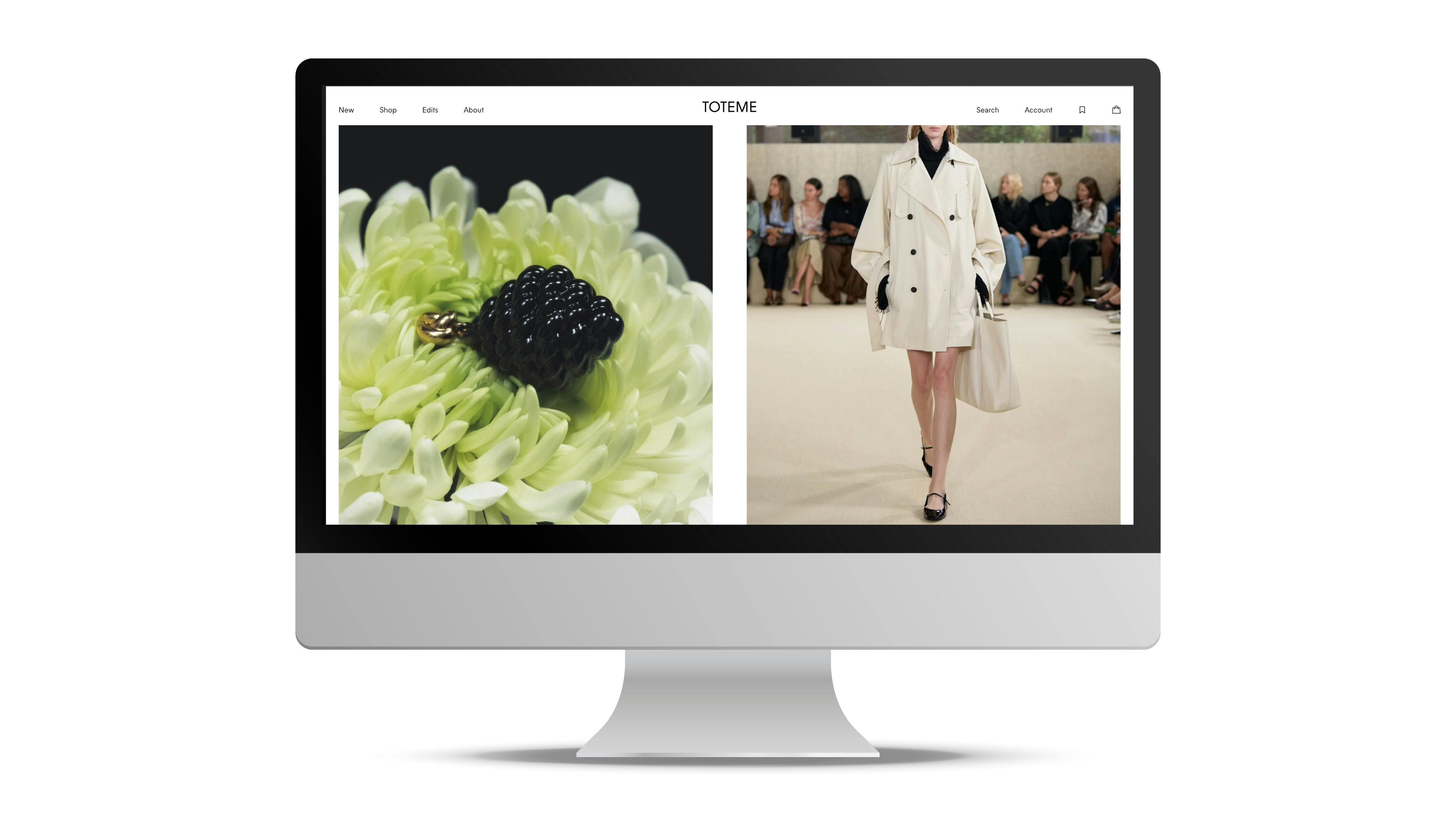
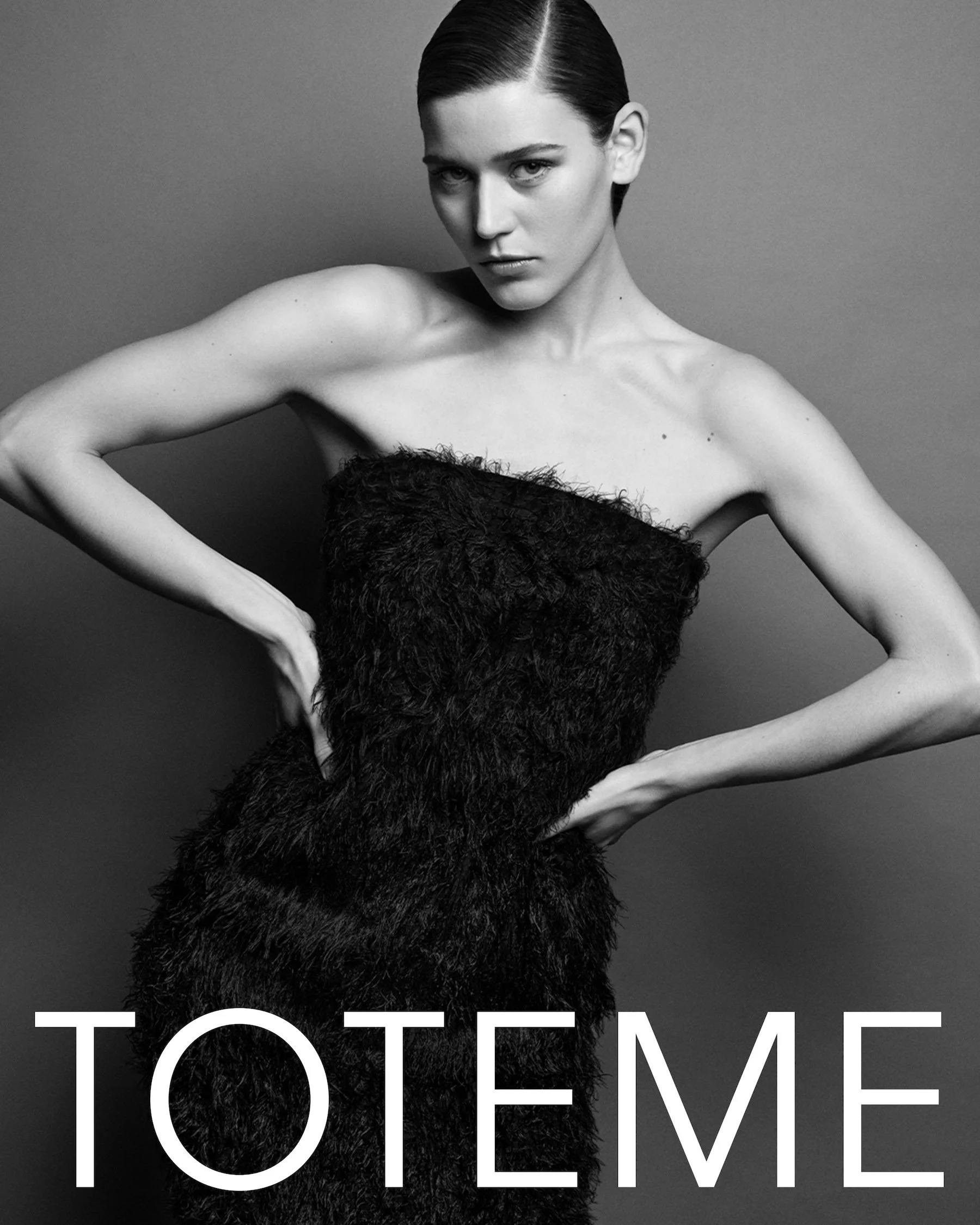
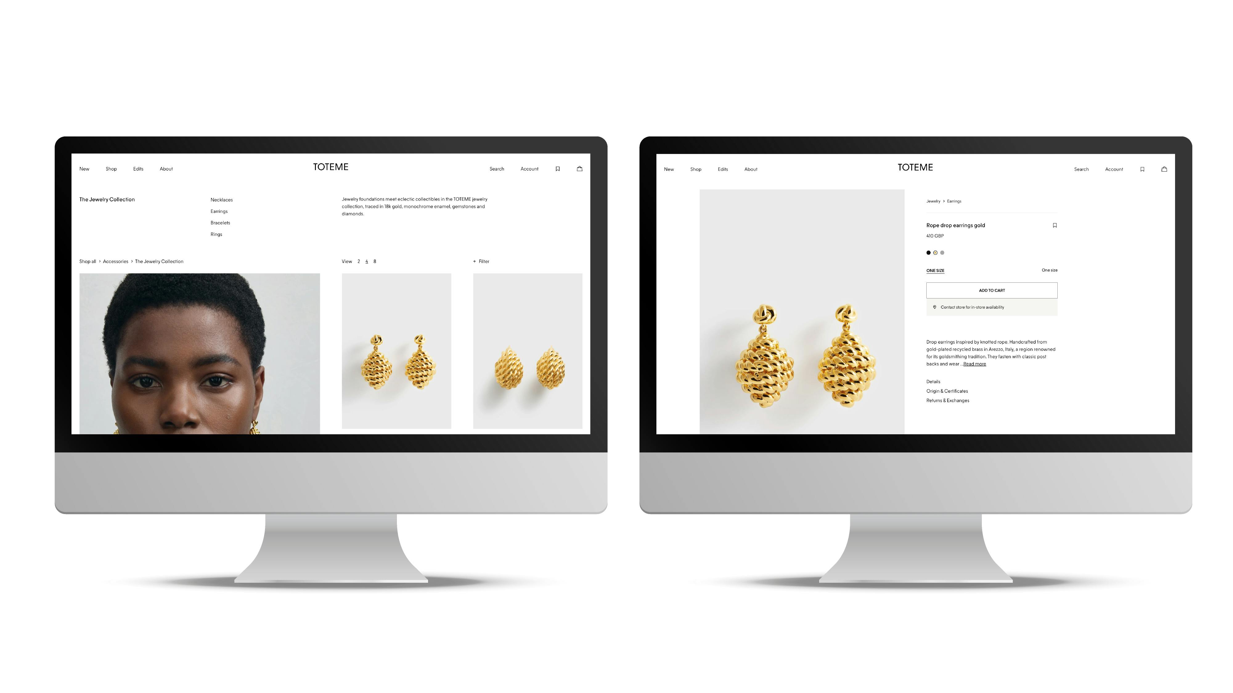
The brands typography is restrained and impeccably spaced, reinforcing a tone that is confident rather than performative. A disciplined grid system gives every element room to breathe, while consistent, art-directed photography carries the narrative without over-explanation.
Crucially, the brand avoids promotional noise. There is no discount theatre, no clutter competing for attention. Navigation is simple, friction is minimal, and the experience protects the mood it has created - composed, assured and intentional.
The result is a brand environment that feels curated, not commercial. Premium, here, isn’t announced. It’s designed into every decision.
Gielly Green
Gielly Green is a study in quiet luxury - not through extravagance, but through control. The brand’s tightly edited colour palette immediately establishes composure and maturity, avoiding trend-led tones in favour of hues that feel timeless and grounded. This restraint creates visual harmony across every touchpoint, reinforcing the sense that the brand is thoughtfully curated rather than creatively impulsive.
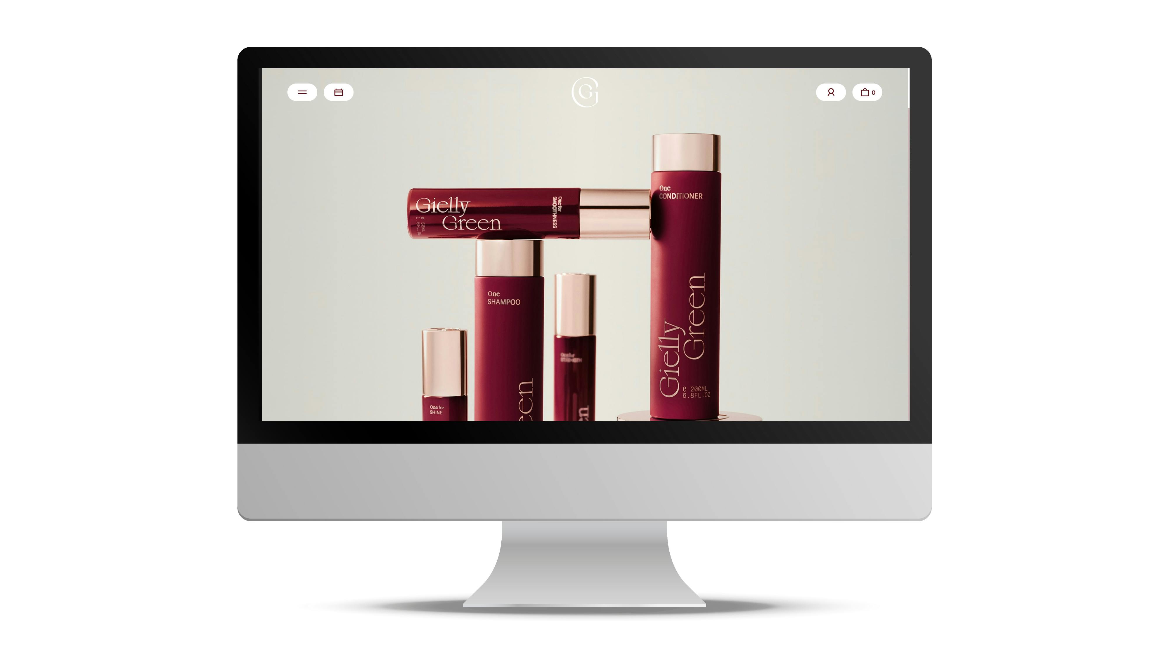
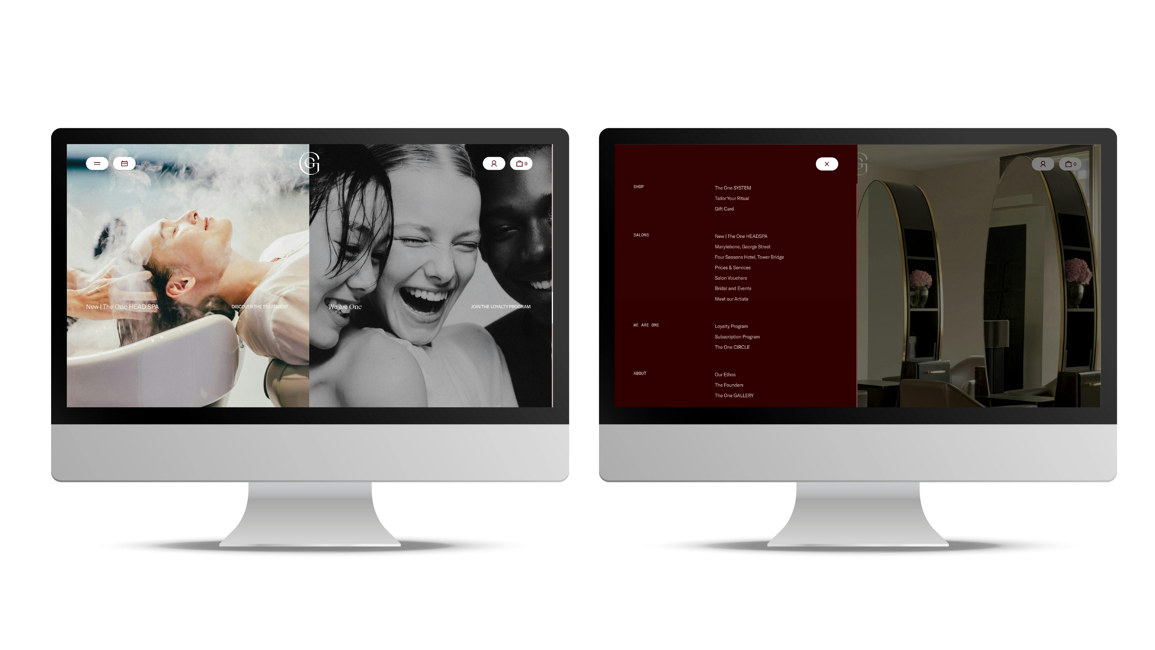
Typography plays a crucial role in this perception. The letterforms are elegant yet understated, carefully spaced and proportioned to feel balanced and effortless. There is no attempt to dramatise the message; instead, the type supports it with calm authority. This is a hallmark of premium branding - confidence without performance.
Imagery is clean, spacious and softly lit, allowing texture and finish to speak for themselves. Nothing feels overly styled or artificially enhanced. The compositions feel deliberate, creating a visual rhythm that slows the viewer down and invites trust. In premium design, pace matters - and here, the pacing is unhurried.
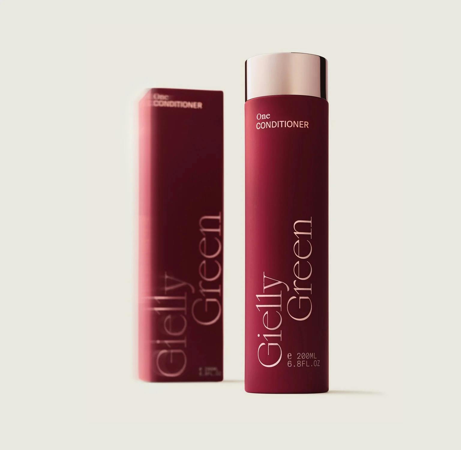
Even product naming reflects strategic discipline. Straightforward names and clear descriptors remove unnecessary embellishment, signalling transparency and assurance. When a brand doesn’t need to exaggerate, customers instinctively perceive integrity.
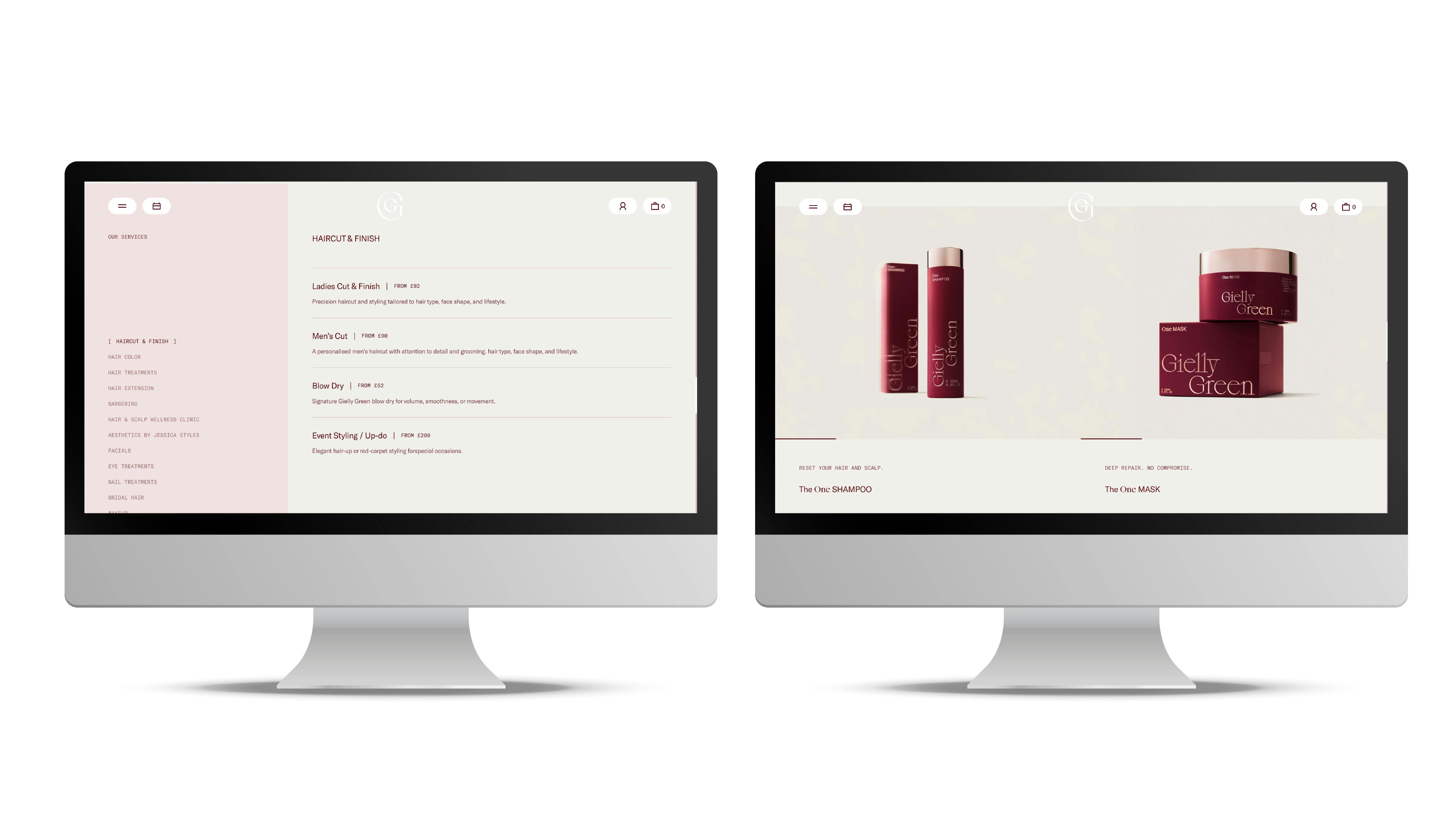
The user experience completes the picture. Navigation is intuitive, interactions are smooth, and the journey from exploration to booking or purchase feels seamless. There are no intrusive prompts or visual distractions competing for attention. Every element has a purpose, and every decision supports the same overarching principle: simplicity executed with precision.
Give Your Brand a Premium Edge
Premium is not about appearing expensive.
It’s about being deliberate.
When your visual language is structured, your photography curated, your typography refined and your systems consistent, customers instinctively perceive value.
Design doesn’t just decorate a brand - it defines its worth.
If you’re ready to elevate your brand’s presence and build a visual system that communicates confidence, clarity and long-term value, we’d love to help.
LET’S TALK
Looking to realign, refresh or redevelop your brand or business marketing strategy? Send us an email at hello@designmc.org or, give us a call direct on 01926 754038 for an informal chat.