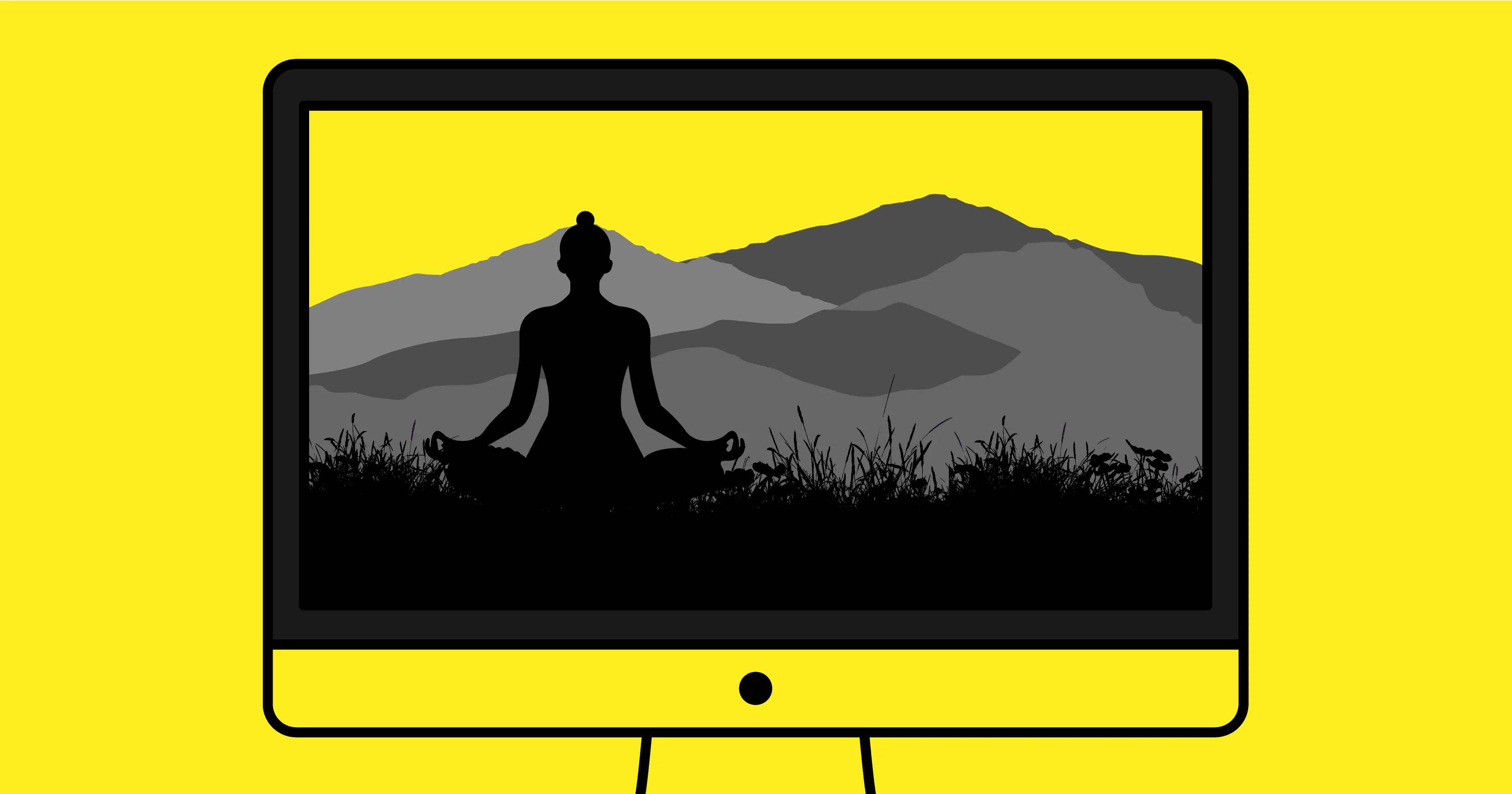
Psychological Comfort: The Art of Effortless Websites
There's a misconception that the best websites are the loudest.
The biggest hero videos. The boldest animations. The longest homepages. The pop-ups, carousels, banners and endless calls-to-action all competing for your attention.
In reality, the opposite is often true.
The highest-performing websites rarely demand attention.
They earn it.
As a creative agency, one of the biggest shifts we've seen over the past few years isn't towards more complex digital experiences - it's towards calmer ones. Websites that reduce mental effort rather than increase it. Experiences that feel intuitive, trustworthy and surprisingly easy to navigate.
We call this psychological comfort.
It's the feeling a visitor experiences when they instinctively know where to go, what to do and why they should trust your business... without having to think about it.
And in today's attention economy, that feeling has become one of the most valuable assets a brand can create.
Your Website Is Competing Against Mental Fatigue
Before a visitor even lands on your website, they're already carrying a huge amount of mental baggage. Throughout the day they've switched between emails, Teams messages, social media feeds, news articles, online shopping, streaming platforms and countless notifications. By the time they arrive on your homepage, their attention is already fragmented and their patience is running low - they have digital fatigue.
This is where many businesses unknowingly make a critical mistake.
In an attempt to grab attention, websites often throw everything at visitors all at once. A pop-up appears before they've even read the headline. A promotional banner competes with a video. Multiple calls to action fight for attention, while oversized navigation menus present dozens of different routes through the site.
The intention is good. The outcome often isn't.
Every additional decision you ask a visitor to make requires mental effort. Every unnecessary distraction increases what's known as cognitive load - the amount of brainpower required to process information and make decisions. The harder your website is to navigate, the harder it becomes for someone to take the next step.
People rarely leave a website because they dislike the business behind it. More often, they leave because another website feels easier to use.
In today's digital world, simplicity isn't just a design choice... it's a competitive advantage.
Let's look at the four principles that psychologically comfortable websites share.
Principle One: They Create Space To Think
Whitespace isn't empty.
It's functional.
The best websites deliberately slow the pace, allowing visitors to absorb information naturally.
Rather than throwing every service, testimonial and offer onto the homepage, they guide people through a carefully considered journey.
Confidence doesn't need to shout.
Principle Two: They Remove Decisions
One of the biggest mistakes businesses make is believing more options create more opportunity.
The opposite is usually true.
Every extra menu item...
Every competing button...
Every unnecessary paragraph...
Forces another decision.
Great UX removes decisions until only the important ones remain.
Principle Three: They Reward Curiosity
Instead of overwhelming visitors immediately, the best websites gradually reveal information.
- Small animations.
- Thoughtful transitions.
- Elegant scrolling.
- Interactions that respond naturally.
The website feels alive without becoming distracting.
This is where modern micro-interactions become powerful - not because they're impressive, but because they reassure users they're moving through the experience correctly.
Here are three brand websites that, in our opinion, demonstrate the art of psychological comfort exceptionally well, each using a different approach to create an experience that feels calm, intuitive and effortlessly on-brand.
Norm Architects: Confidence Through Restraint
When we analyse the Norm Architects website from a branding perspective, what stands out isn't what they've added... it's what they've deliberately chosen to leave out.
Nothing about the customer experience of the website feels rushed or desperate for attention. The homepage isn't trying to persuade visitors with endless messages or competing calls to action; instead, it quietly builds confidence through simplicity.


Beautiful, high-quality photography takes centre stage, supported by understated typography and an effortless navigation that almost disappears into the background.
Every design decision feels intentional, creating a calm, considered experience that perfectly reflects the architecture and interiors the practice is known for.
To us, that's the hallmark of exceptional branding. The website doesn't simply showcase the brand - it behaves like the brand, expressing its values and personality through every interaction.
Kinfolk: A Website That Behaves Like the Brand
Kinfolk has always championed the idea of living more intentionally, so it would have been easy for its website to simply communicate that message through words and imagery alone.
Instead, what impresses us is how the entire digital experience embodies the brand's philosophy.
Every interaction feels considered, every transition feels unhurried, and every design decision encourages visitors to slow down rather than rush through the content.


The generous use of whitespace, restrained typography and carefully curated photography create an immediate sense of calm, allowing the content to breathe instead of competing for attention. Nothing feels forced or overly engineered.
Even the scrolling experience has a subtle weight to it, encouraging visitors to engage with each story at a more deliberate pace, almost as though they're turning the pages of a beautifully produced magazine rather than navigating a website.

What's particularly interesting is that Kinfolk resists many of the conventions we've come to expect from modern websites. There are no intrusive pop-ups demanding an email address within seconds, no flashing promotional banners and no overwhelming collection of competing calls to action. The website trusts that if the experience is enjoyable enough, visitors will naturally continue exploring. In our opinion, that's a mark of confidence that many brands could learn from.
Ultimately, Kinfolk demonstrates that psychological comfort isn't achieved by removing personality or creating something overly minimal. It's achieved by designing an experience that aligns perfectly with the brand's purpose.
Viabizzuno: Making Complexity Feel Effortless
On paper, Viabizzuno, it has every reason to feel overwhelming.
The business offers an extensive portfolio of architectural lighting solutions, technical specifications and product variations, all aimed at a highly considered audience of architects, designers and specifiers. Yet somehow, the experience never feels complicated.
Rather than trying to showcase everything at once, the website reveals information progressively, allowing visitors to explore naturally and at their own pace. Navigation is intuitive, product categorisation is logical, and every interaction feels purposeful.


There's a clear understanding that good user experience isn't about showing people more... it's about helping them discover the right information with as little effort as possible.

Premium photography, restrained typography and generous spacing elevate what could otherwise be a highly technical catalogue into something that feels aspirational and beautifully crafted. The products become the focal point, with the interface quietly supporting the journey rather than competing for attention.
It's a powerful reminder that even businesses with vast product ranges and complex offerings don't need complex websites. In fact, the opposite is often true. The more sophisticated your business becomes, the more valuable simplicity becomes for your customers.
Effortless Doesn't Mean Simple to Build
One of the biggest misconceptions about great websites is that simplicity is easy to achieve.
In reality, it's often the result of asking hundreds of questions, refining countless details and making deliberate decisions about what to leave out. Every interaction, every page and every user journey should exist for a reason.
At Designmc, we believe the most effective websites don't overwhelm visitors with features or distractions. Instead, they quietly guide people towards the information they need, creating an experience that feels natural, intuitive and reassuring from the very first click.
If reading this has made you look at your own website a little differently, we'd love to continue the conversation.
Give us a call us on 01926 754038 or drop us an email at hello@designmc.org
LET’S TALK
Looking to realign, refresh or redevelop your brand or business marketing strategy? Send us an email at hello@designmc.org or, give us a call direct on 01926 754038 for an informal chat.