Branding | Brand Identity | Website | Marketing


The Brief
The Academy Clinic is part of the UK’s largest Cosmetic Medical School, in partnership with Harley Academy, and is the leading body in aesthetic treatments throughout the UK.
With the shift of audience activity moving heavily towards the online world, The Academy Clinic acknowledged the need for a rebrand – to align with market expectation and to continue to attract the very best medical professionals.
A core stipulation with the rebrand was to maintain the visual link of the partnership with Harley Academy, whilst also striking a balance of attracting the correct target audiences – both customer and professional.
Our Approach
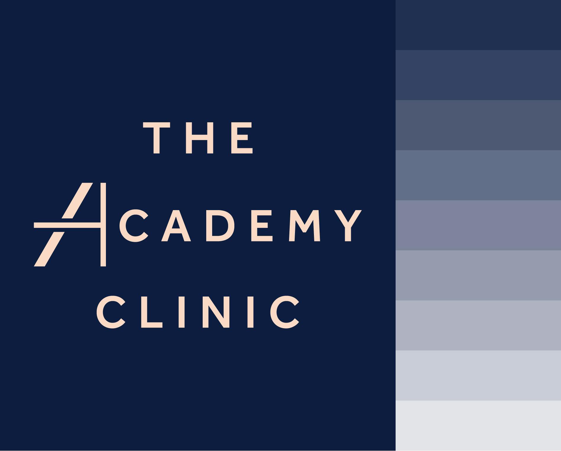
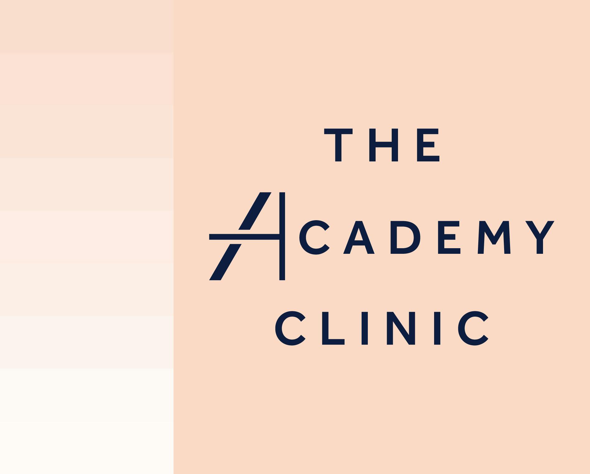
We started the rebrand by looking at the core foundations of the importance of colour and the business partnership link.
In order for the colours of the new brand identity to be successful, the palette needed to strike a visual balance of appealing to a mixed demographic of female and male customers, whilst also appealing to medical professionals.
The visual link to tie the brand partnership with its parent company, Harley Academy, was a strict request from the client. Therefore, it was a key challenge to retain a clear link of the businesses, but at the same time evolve the brand to meet the client’s expectations of being more chic, more modern and more dynamic.
Creative Development
With the new brand logo designed and colour palette established, we set out to develop the brands full identity. Exploring a range of ideas, we created an original suite of supporting graphics that was directly formed from the various angular lines of the ‘A’ within the logo.

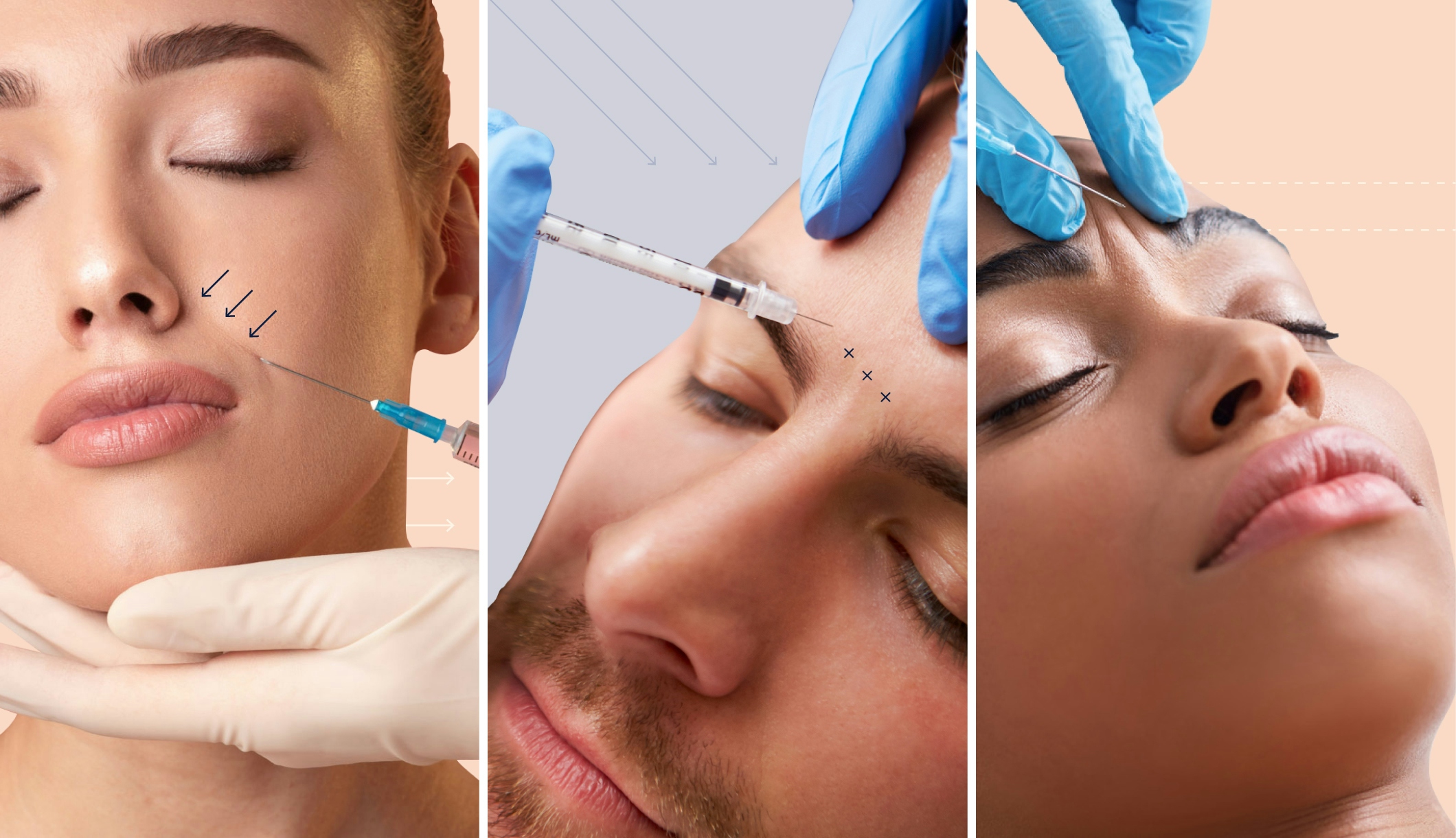
We then further expand the identity with the creation of a graphic language unique to the industry sector. After researching the medical procedures and services of the client, we created a visual language that was a direct graphic interpretation of the marks a clinician would make on the skin of a patient.

During the branding process the client requested that we look at creating a suite of icons to represent the various services of the academy.
Remaining mindful of the new brand simplicity, we created a set of icons that complimented the identity by combining the use of angular lines with slender icon designs.

Solution
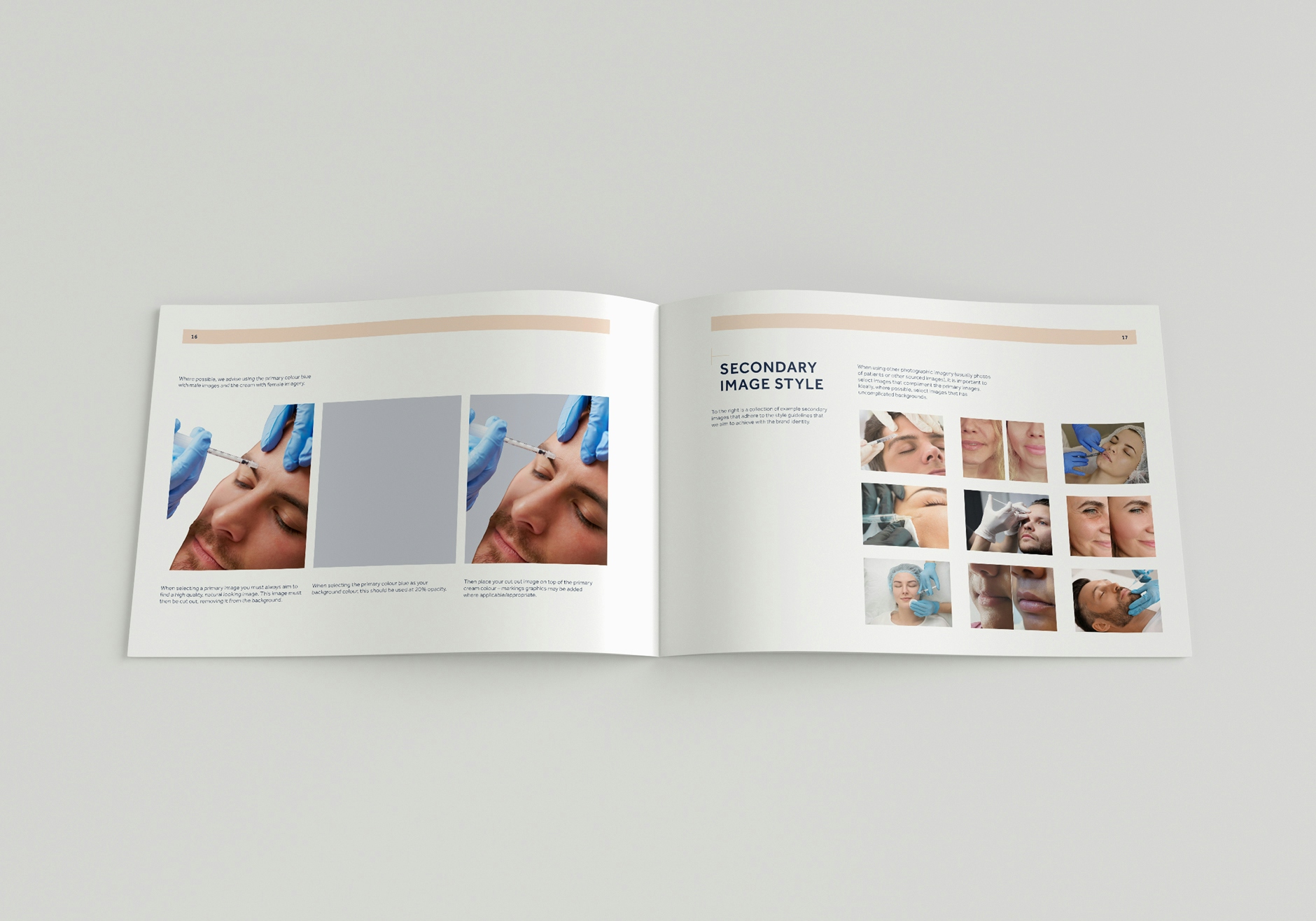
With the new brand identity set, we proceeded to put together a comprehensive brand guidelines document for the client.
The document clearly sets out the principal guides of the brand and its assets, across offline and online application, assuring that brand consistency remains for any future use.
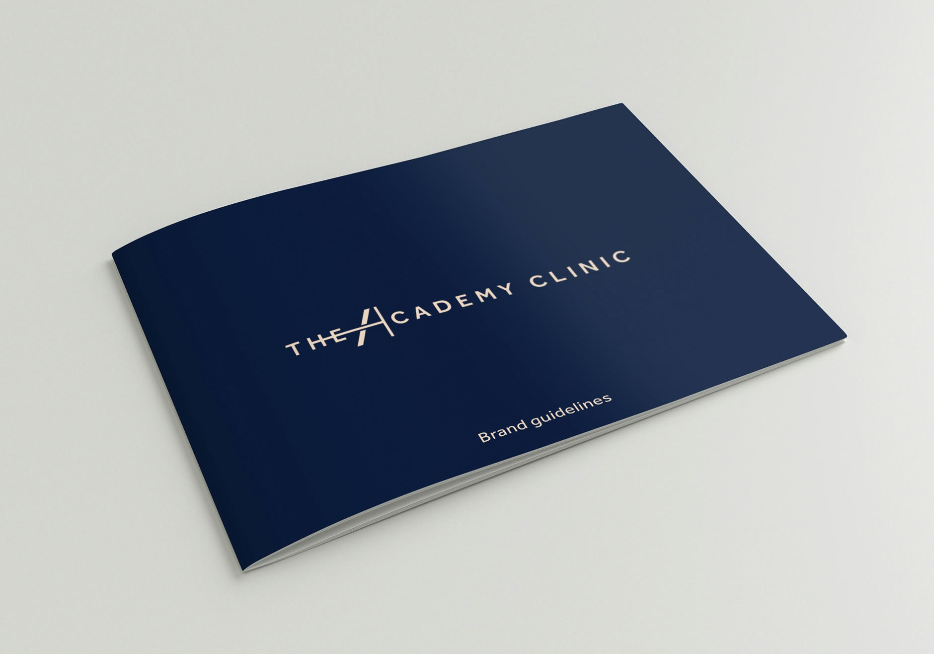
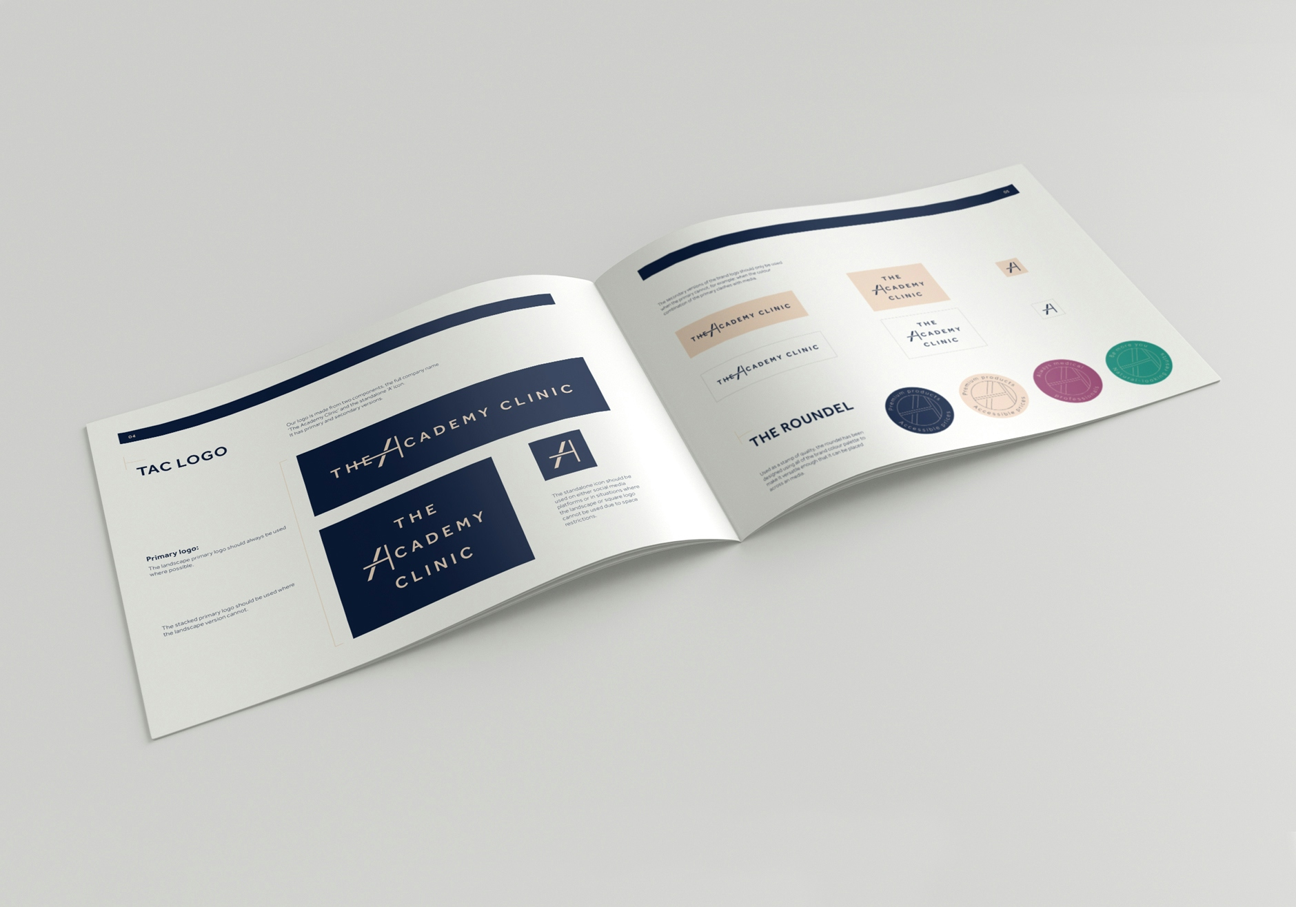
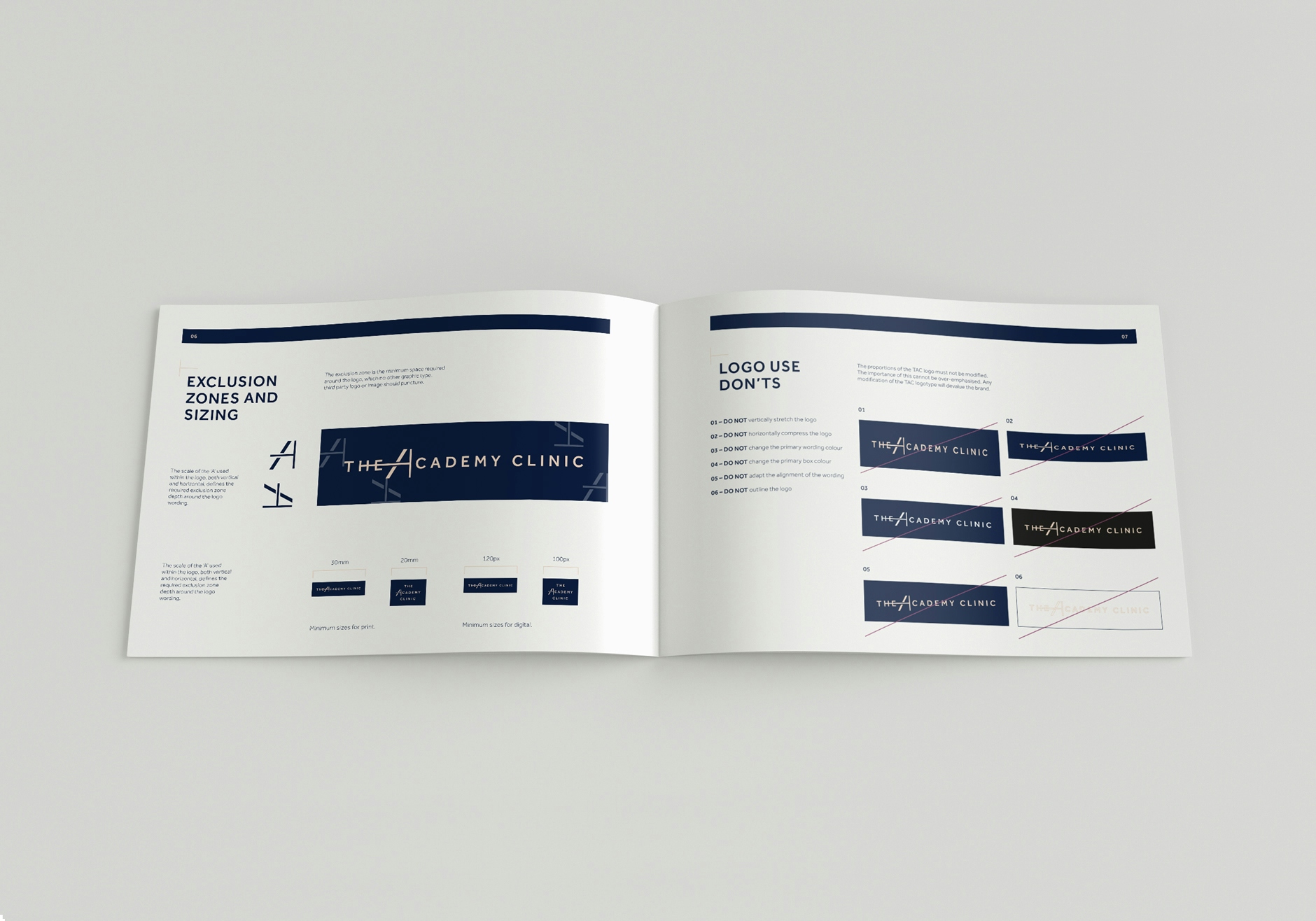
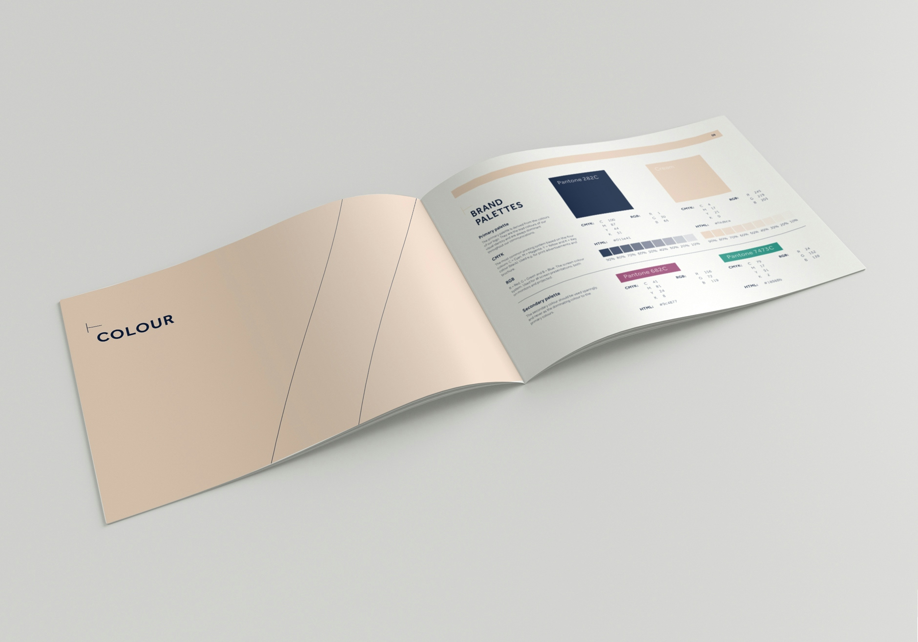
During the process the client asked our team to recreate an existing promotional video short in the new look brand style.
The video would be used across multiple channels to publicise the differentiating facts about the clinic and its services to a wide audience.
With the branding established, we were next tasked to redevelop the businesses website.
Utilising the new brand identity, we created and developed a website that presented clear, concise and engaging user journeys. With a core intension of educating and informing the customer about the range of treatments, the new site guides the user through the site with a friendly and medical-led tone.
CLIENT WORDS
“The passion the team at Designmc have for their work is second to none, and the quality of the work delivered was to an exceptional standard. The level of communication throughout was very impressive and our feedback on design solutions was always understood and digested fully.
We are excited to have a design agency that we know can grow with us in the future.”
Other Work
LET’S TALK
Looking to realign, refresh or redevelop your brand or business marketing strategy? Send us an email at hello@designmc.org or, give us a call direct on 01926 754038 for an informal chat.

