Branding


The Brief
Bircroft Private is an established and highly respected property and real estate finance firm. Acting on behalf of property companies, family trusts and high net worth individuals, the team specialises in sourcing and delivering tailored funding solutions for the development of property portfolios.
As the business moved into a new decade, the founding members recognised that the brand required modernisation to ensure it remained competitive in the modern market.

Our Approach
From the offset we understood it was pivotal for the client that we preserved the stature of the business.
In order to assure that we repositioned the brand successfully, our process started by investigating and discovering the views and opinions of existing customers to the business. The information gathered, provided us with a clear picture of what qualities distinguish the business and, more importantly, what the perception was of the customers who experienced working with the team.
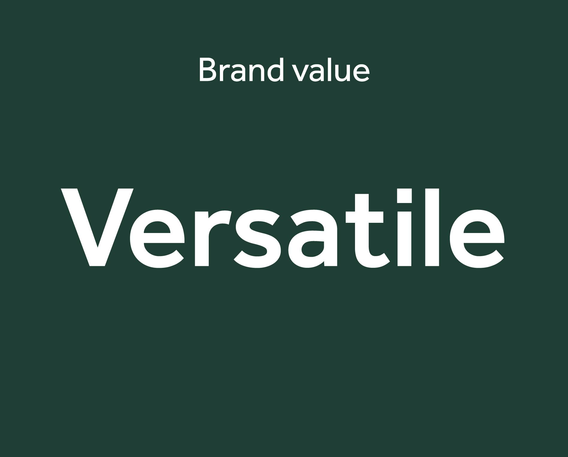
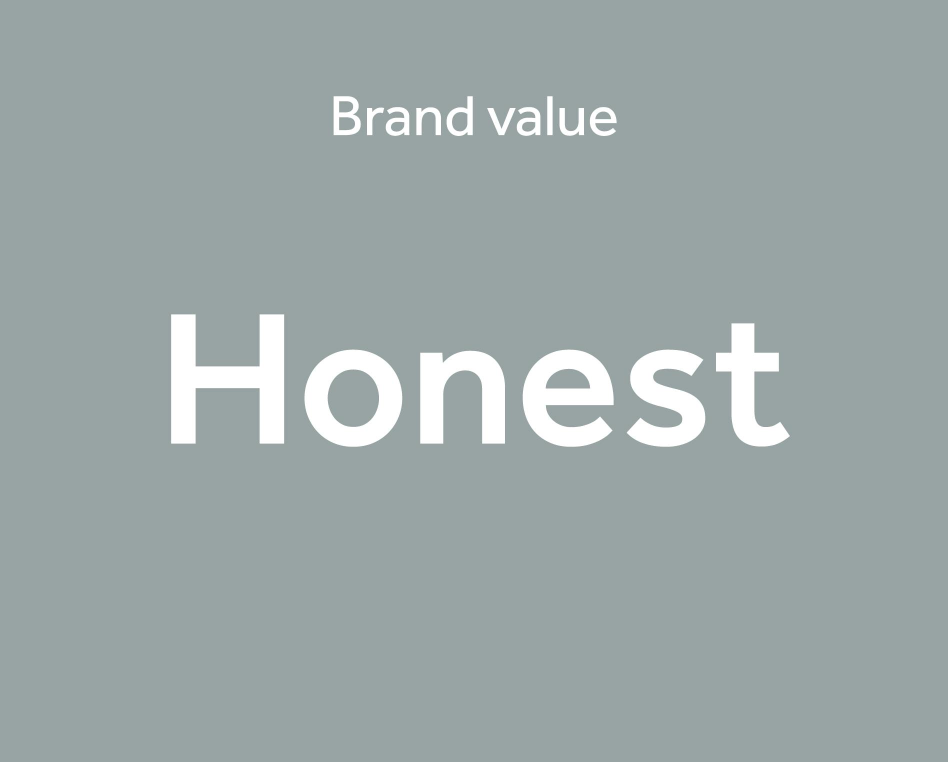
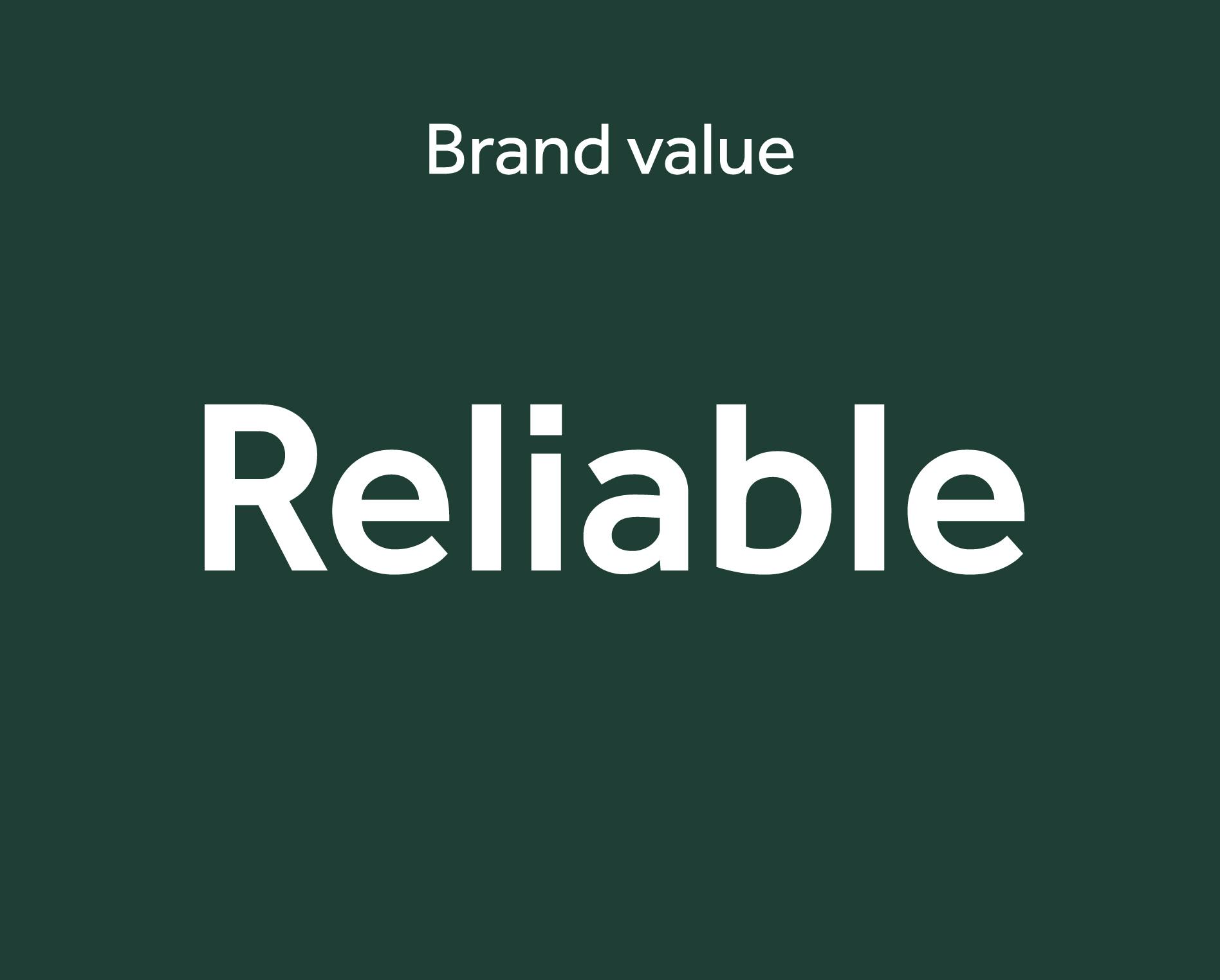
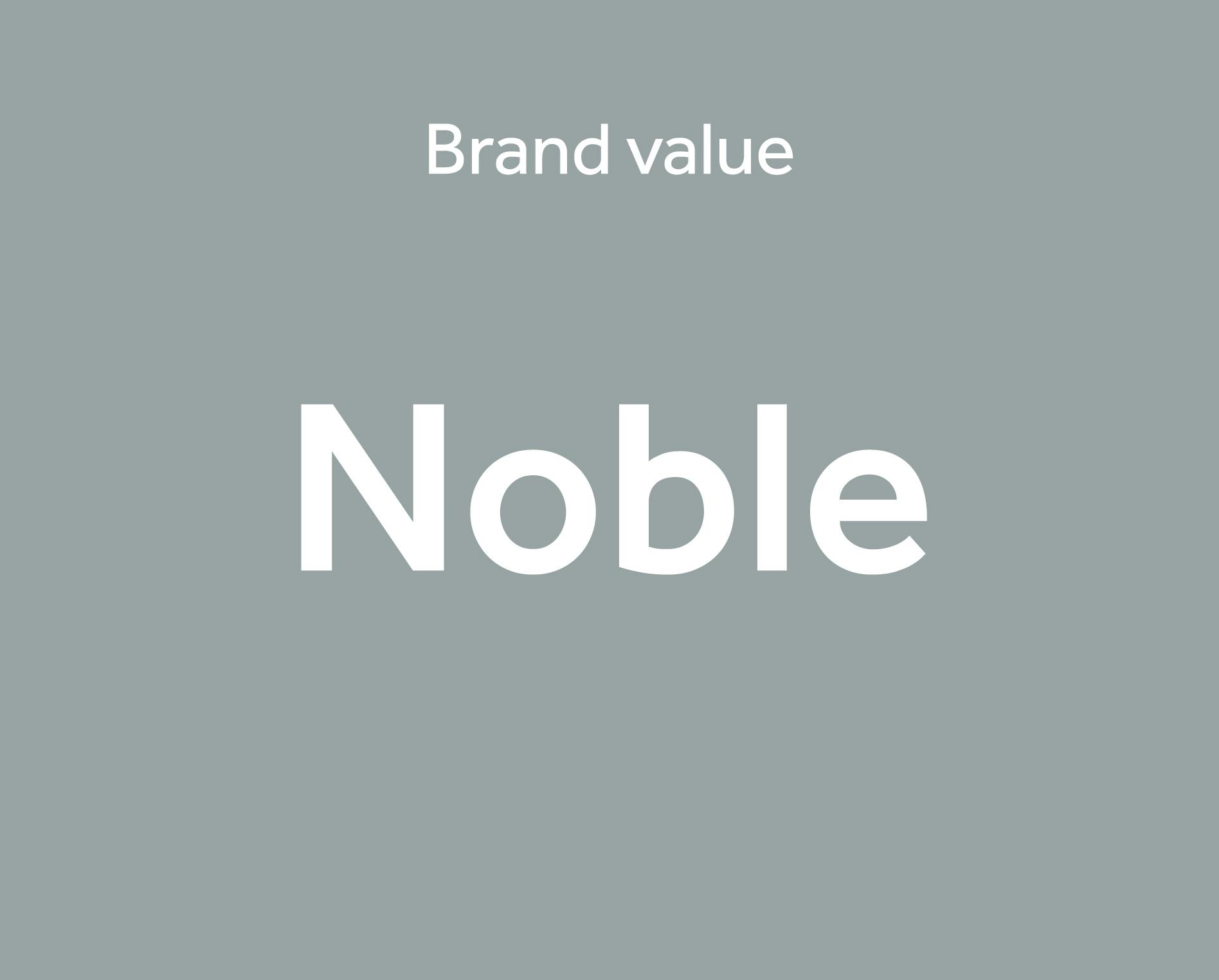
With a clear understanding of the business, we defined the core values of the brand. These values embody the unique attributes of the team and the business, and set the foundations to the brand.
Creative Development
Our research led us to interpret the clients industry sector as one defined by a businesses ability to adapt, to be individual, and to manage complex situations. This evaluation developed our creative thoughts towards an expression that the industry was much like a game of Chess.
After careful consideration, it was decided that the Knight was the piece on the Chess board that best encapsulates the qualities of the business within the marketplace.
Chess board definition: The Knight might not be the most powerful piece on the board, but his tenacity and skill set is unique, getting him the recognition needed to be used most frequently.
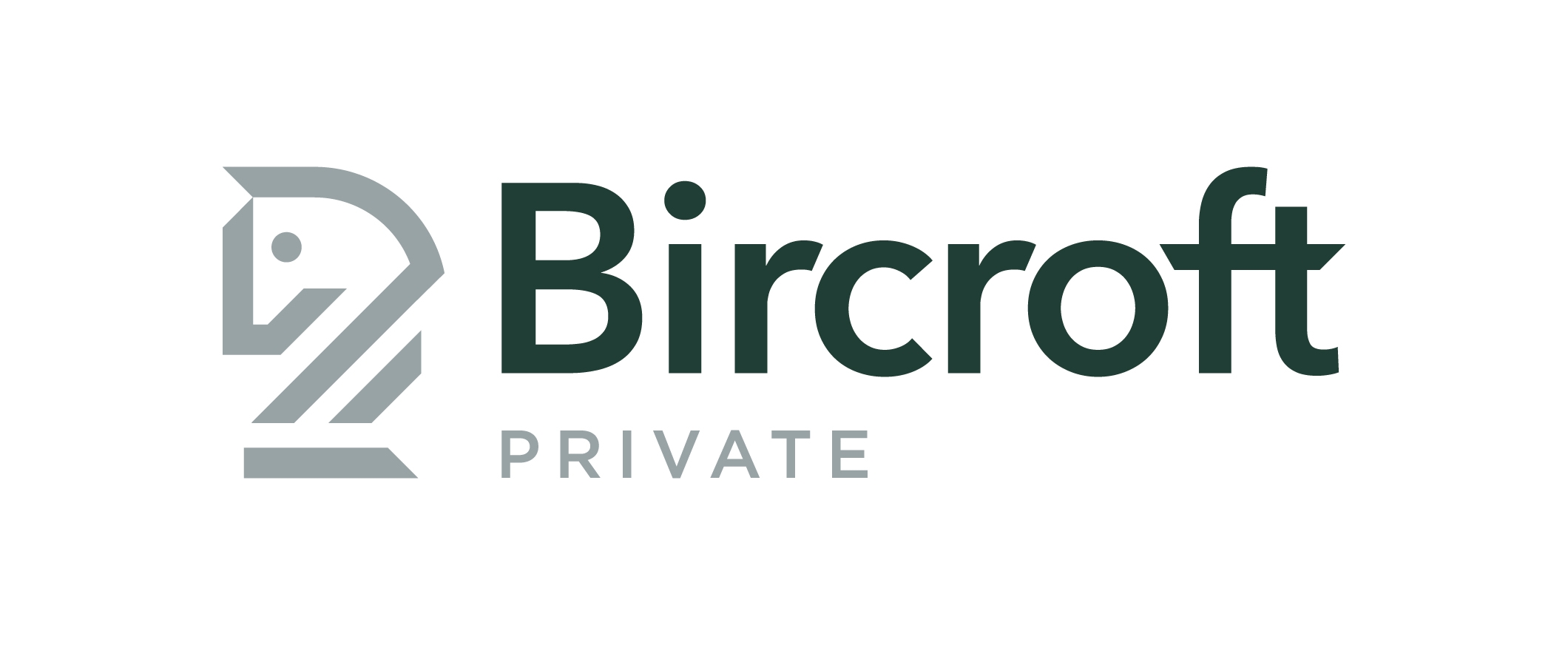
The Knight acts as the symbol of Bircroft Private – the businesses values, attributes and its client loyalties.
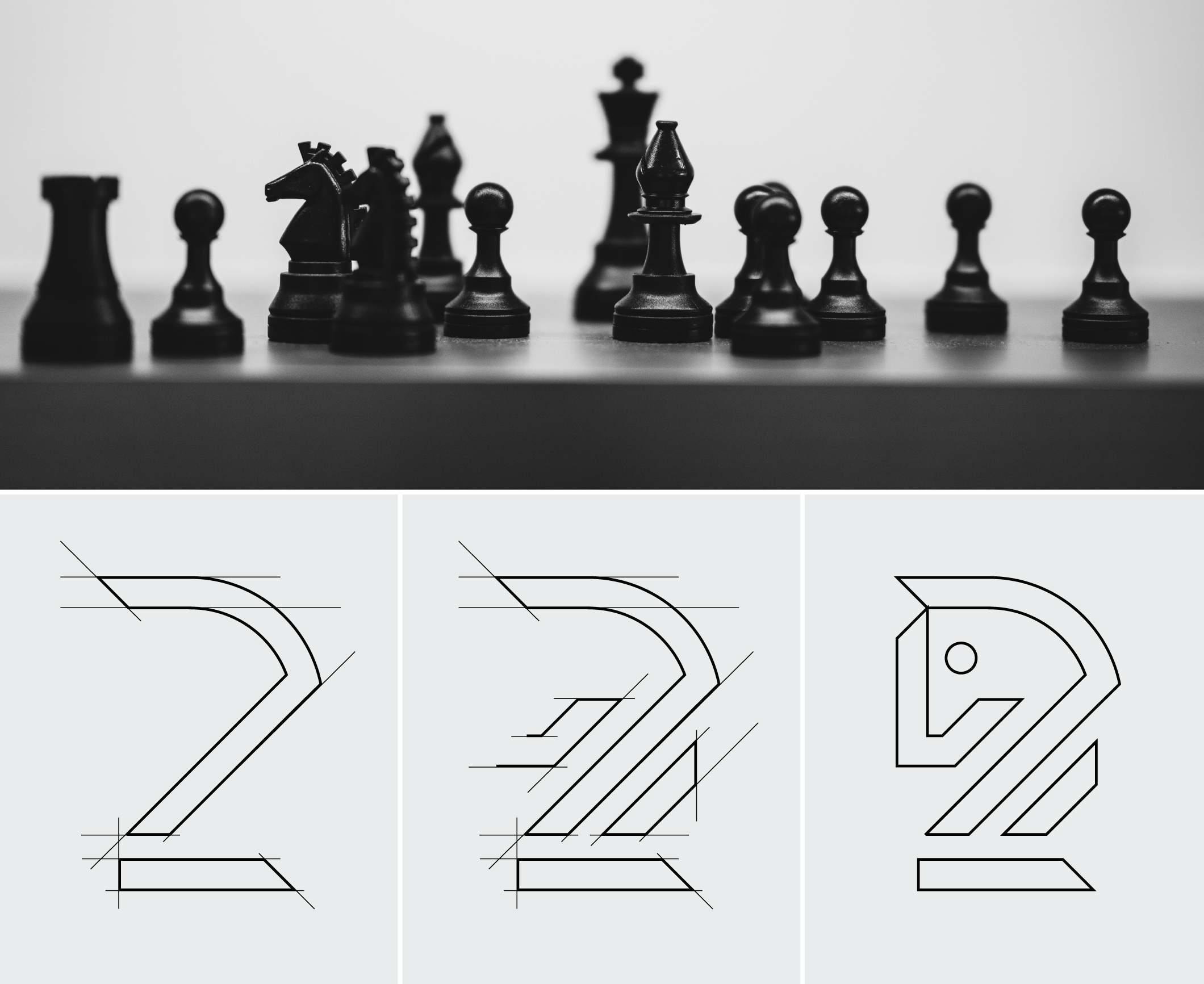
To meet the ambition of the client, of repositioning the business within the modern market, we developed the new brand symbol and logo mark to be simplistic in style. The dynamic design enables the branding to be progressive and versatile with its application and use.
It was also important that the branding retained a sense of heritage and high end stature, to appeal to high net worth clientele. To achieve this we explored traditional colour palettes that struck a fine balance of feeling authentic and contemporary.


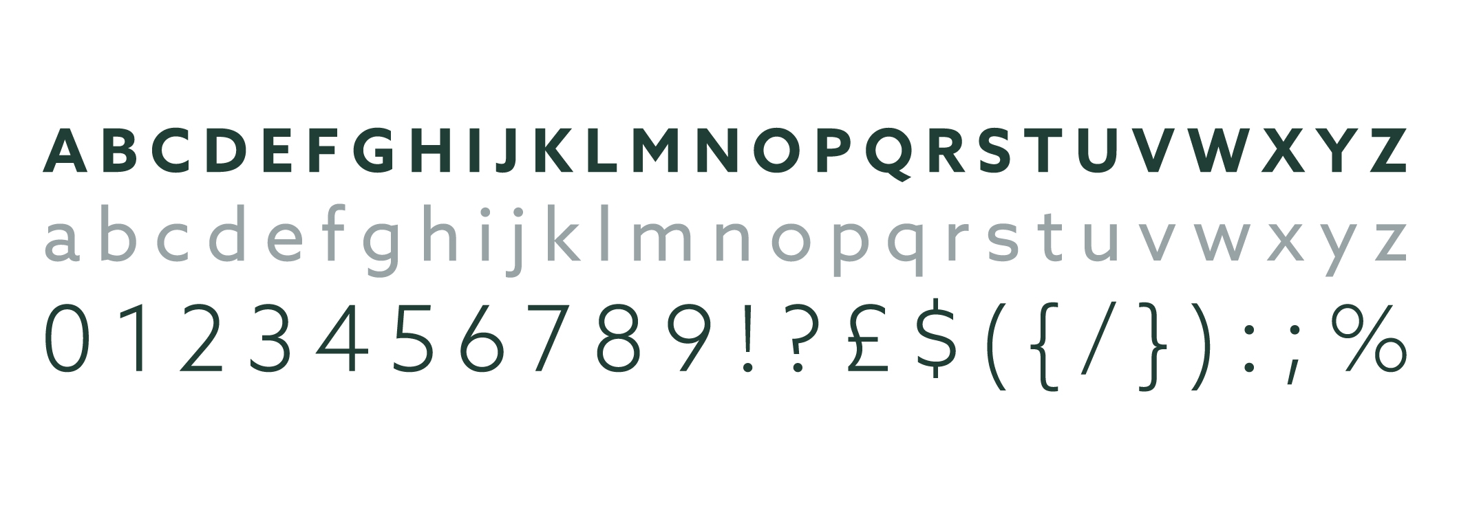
To compliment and support the style of the logo symbol, we used an uncomplicated and user-friendly font for the brand wording. This style of font aligns with the financial aspect of the business, ensuring that the brand doesn’t alienate professionals that would engage with the business from this industry sector.
Solution
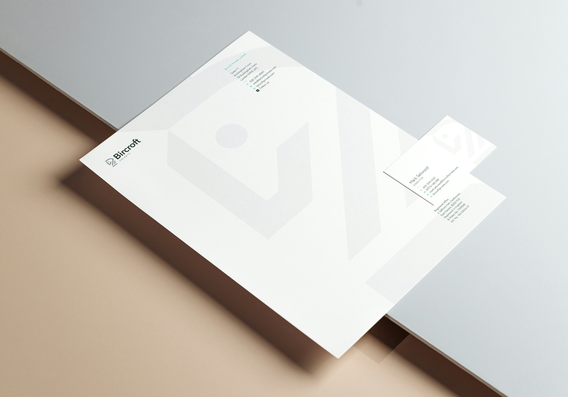
With its precise and clean design style, the new branding repositions the client as a forward-facing business within the modern market. By evolving the brand identity to better align with new market and audience expectations, the business is future-proofed for its continued success.
Though the new brand has modern appeal, its design qualities are firmly rooted in retaining the established stature of the business amongst the customers and its competitors.
Other Work


LET’S TALK
Looking to realign, refresh or redevelop your brand or business marketing strategy? Send us an email at hello@designmc.org or, give us a call direct on 01926 754038 for an informal chat.