Branding | Website | Marketing
The Brief
Founded by the globally respected Anatomist, Professor Sebastian Cotofana, this business has grown into a leader in anatomical education. Now at a pivotal stage, the client wanted to elevate their world-class educational offerings by taking direct ownership of delivering learning resources and guidance in an accessible, streamlined format.
To realise this vision, the client identified the need for a refreshed brand identity and a modernised, user-friendly website to serve as the foundation for a more impactful and accessible educational experience.
Our Approach
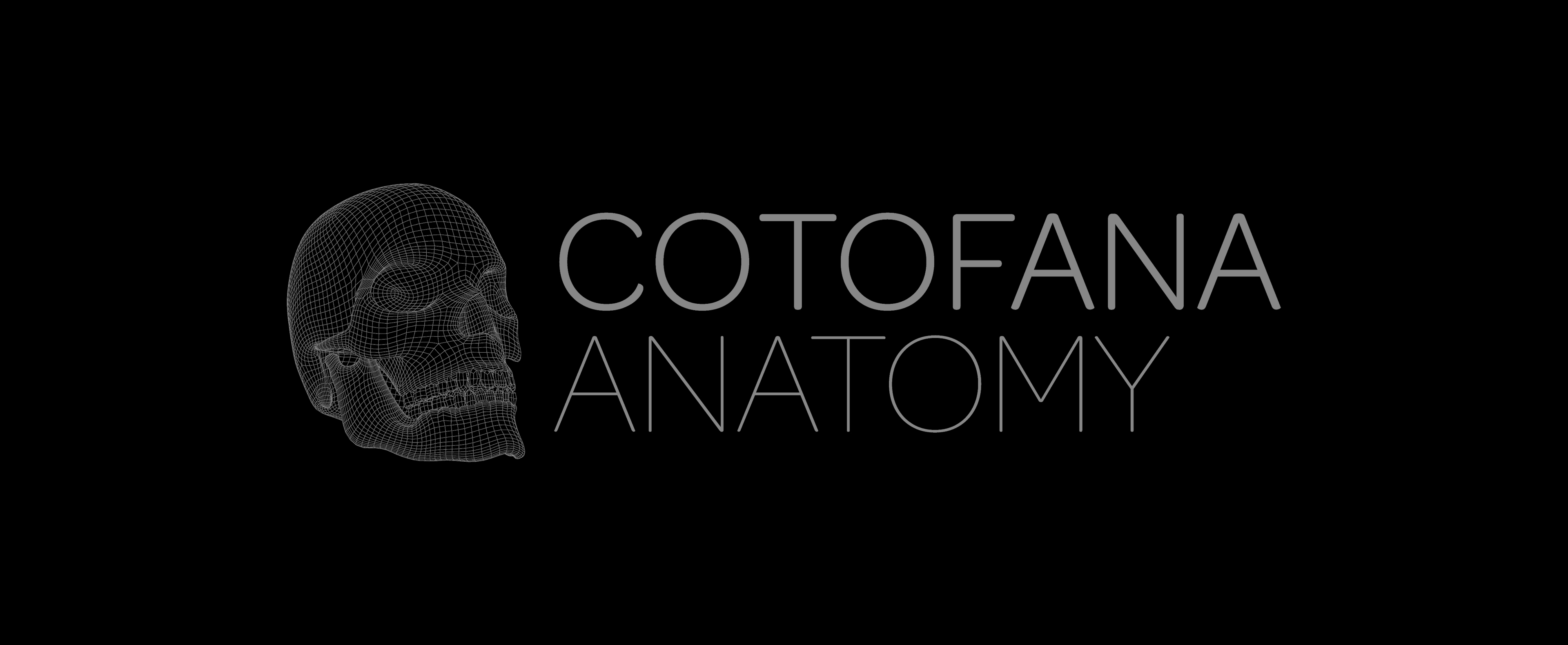
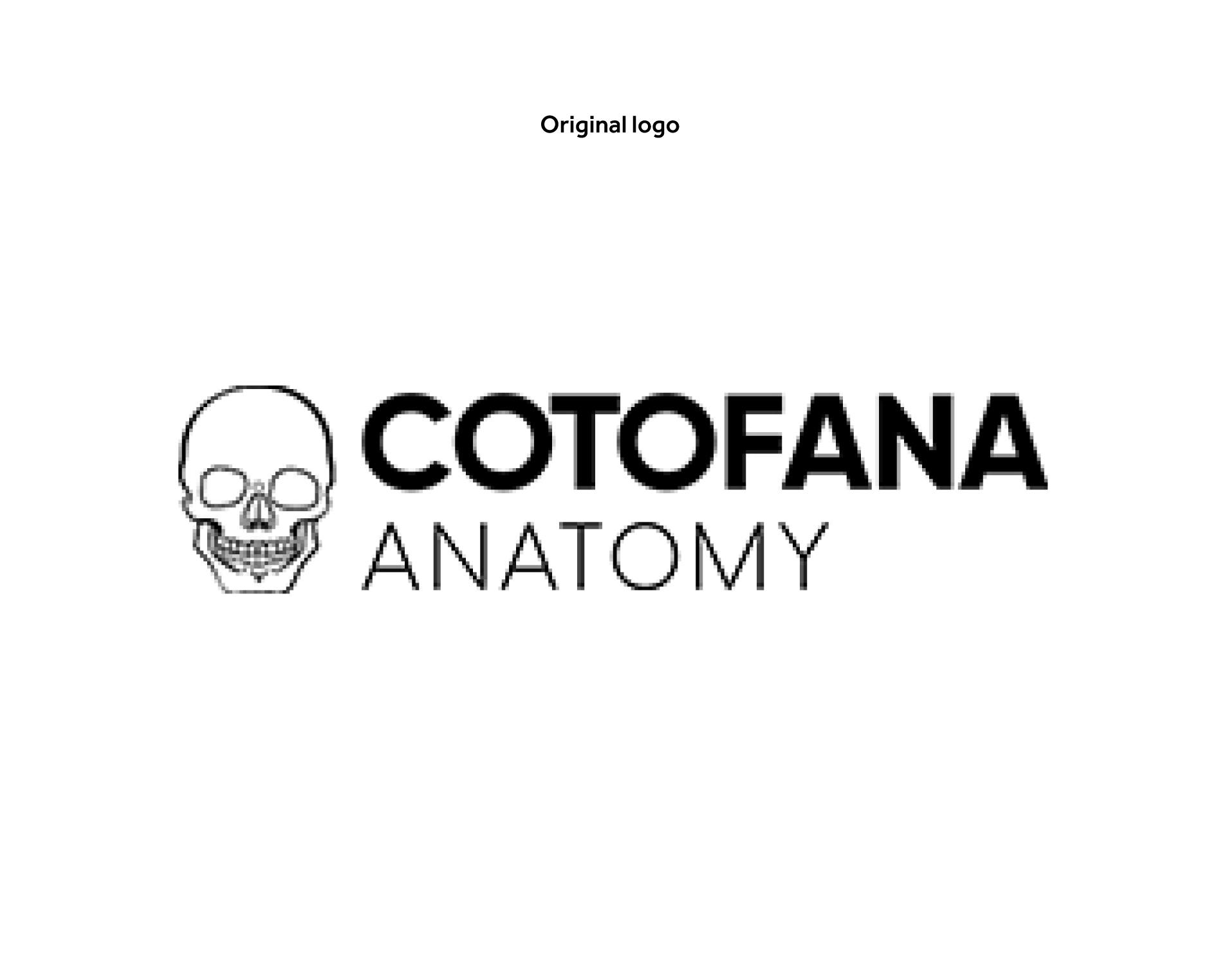
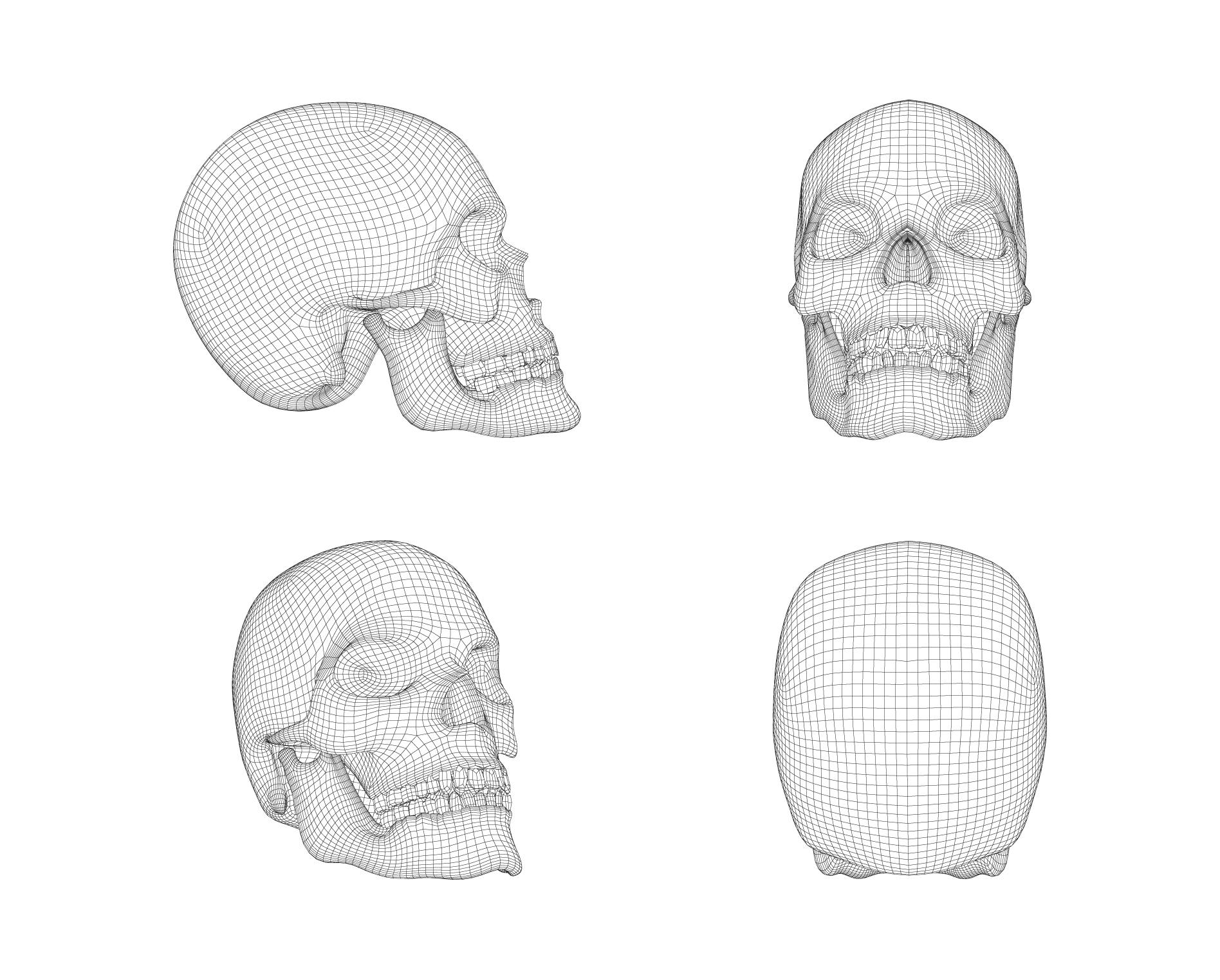
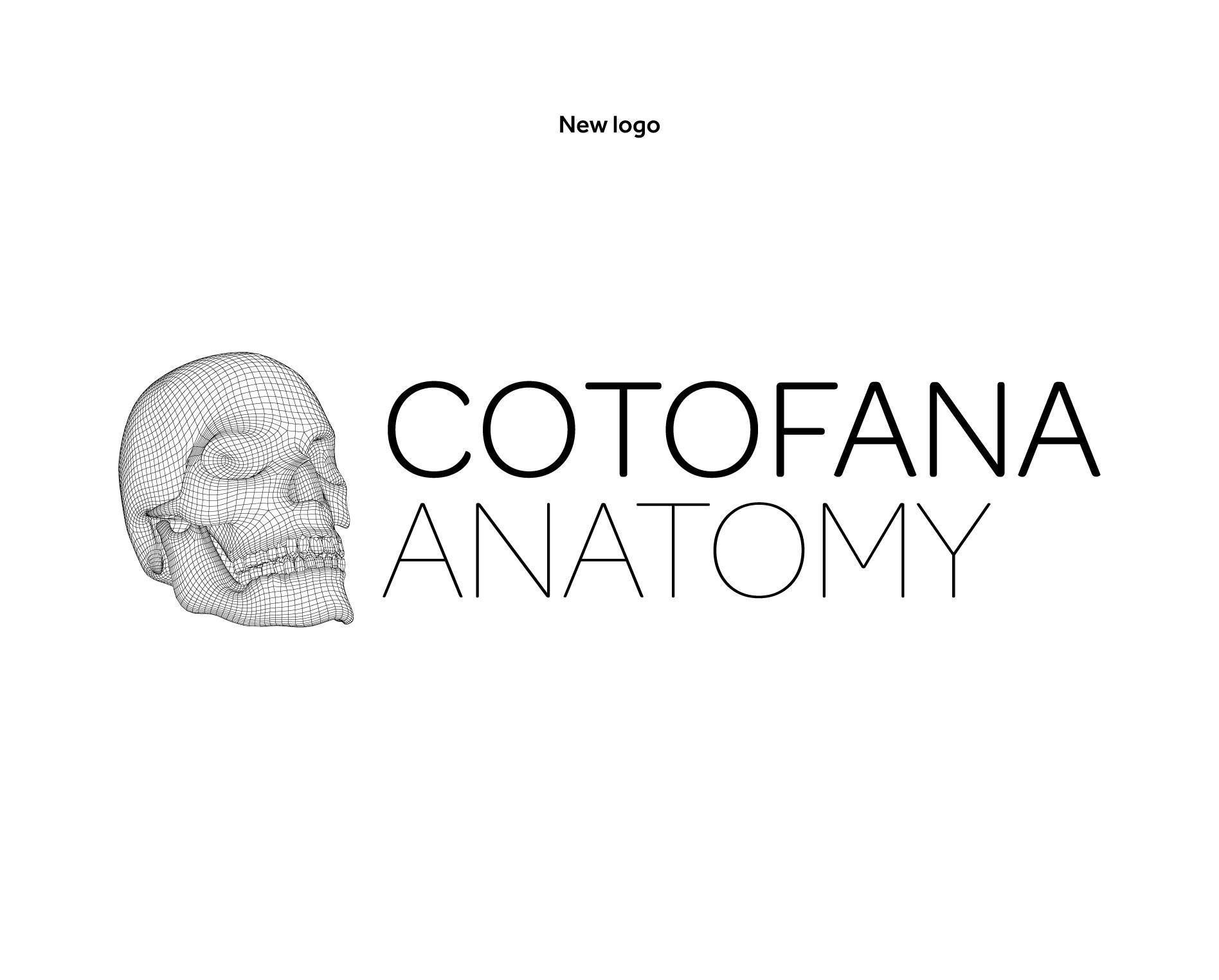
We began the project with a focus on refreshing the brand identity, honouring the client’s commitment of retaining their iconic skull - a central element of their brand.
With this in mind, we explored ways to modernise the skull symbol, refining it to align with a contemporary aesthetic while keeping its recognisable essence.
Since anatomical education is at the core of the business, our creative direction leaned into graphic interpretations of the human body. This approach allowed us to craft a visually distinct and professional look, with subtle nods to the contours and complexity of anatomy, resulting in a brand identity that reflects both the scientific precision and the accessibility the client envisions for their educational platform.
Creative Development
With the new logo design in place, our next focus was on building a cohesive and expansive brand identity. Working closely with the client, we anchored our approach around their core values, vision, and aspirations for the future.
This collaborative process allowed us to help define and refine the brand’s voice, ensuring it would resonate as both "intellectual" and "inspiring" - qualities that align perfectly with the client’s mission of guiding and supporting anatomical education.
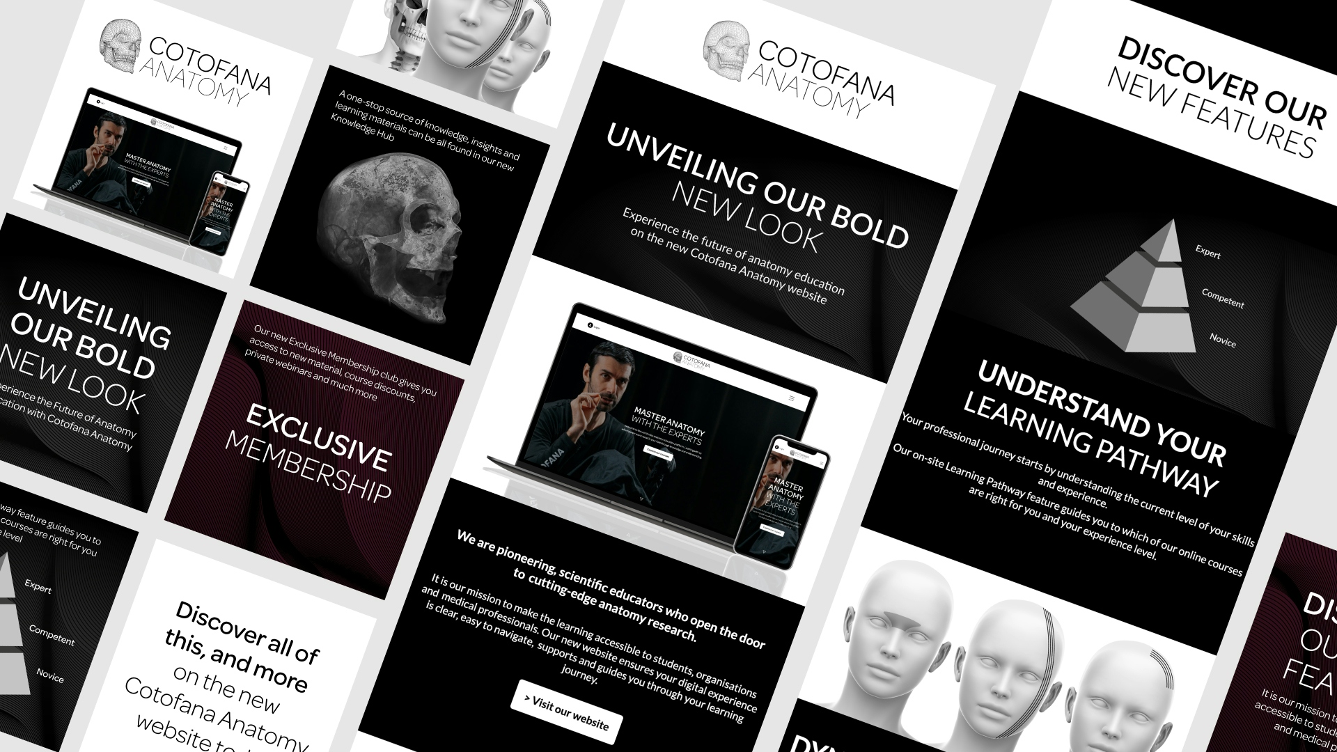
To enhance the visual identity, we developed a graphic style that echoed the contours of the human body, creating a cohesive design language. This graphical element not only serves as a visual representation of the brand’s anatomical focus but also brings a modern, cohesive feel to the identity, reinforcing the client’s commitment to excellence in anatomical education.
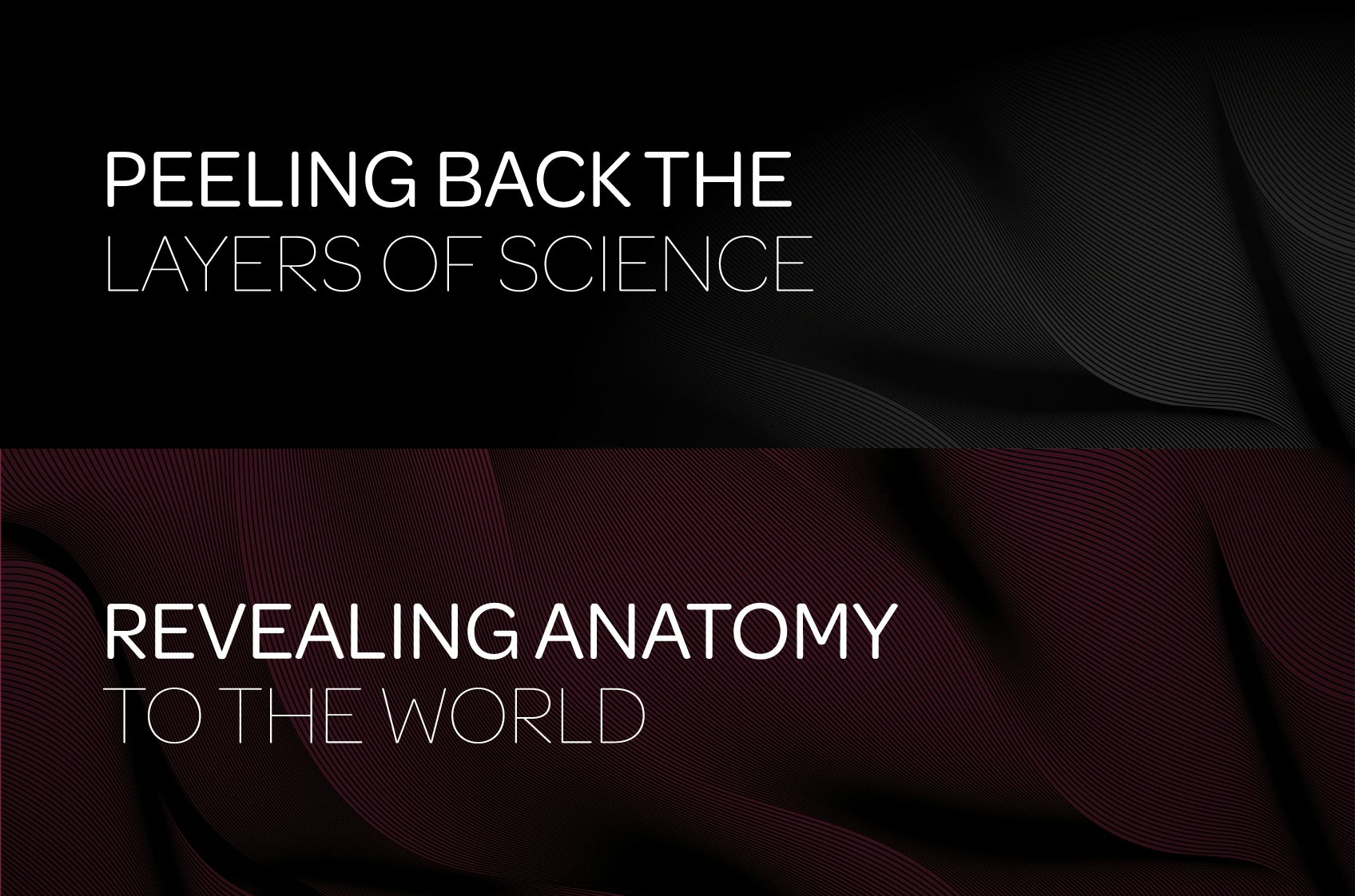
Revitalising the presentation of the client’s online courses was a key focus area in the brand redesign. With the goal of creating a more accessible solution for a global audience, we reimagined how the client’s anatomic education offerings could be showcased.
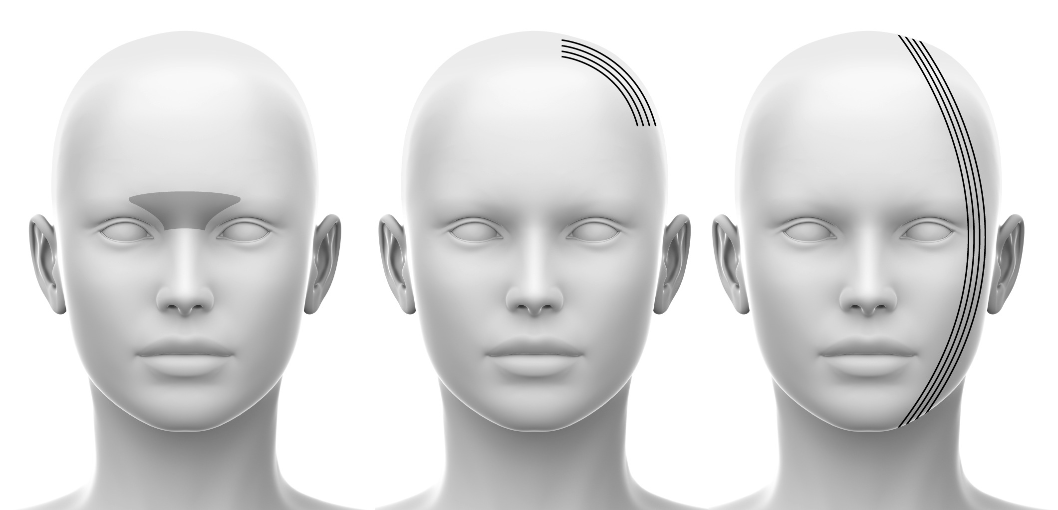
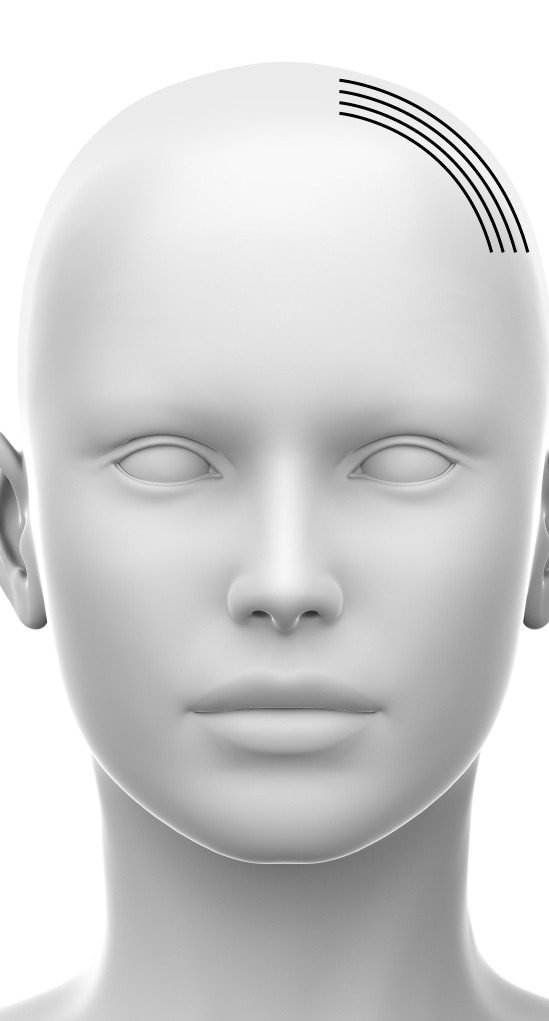
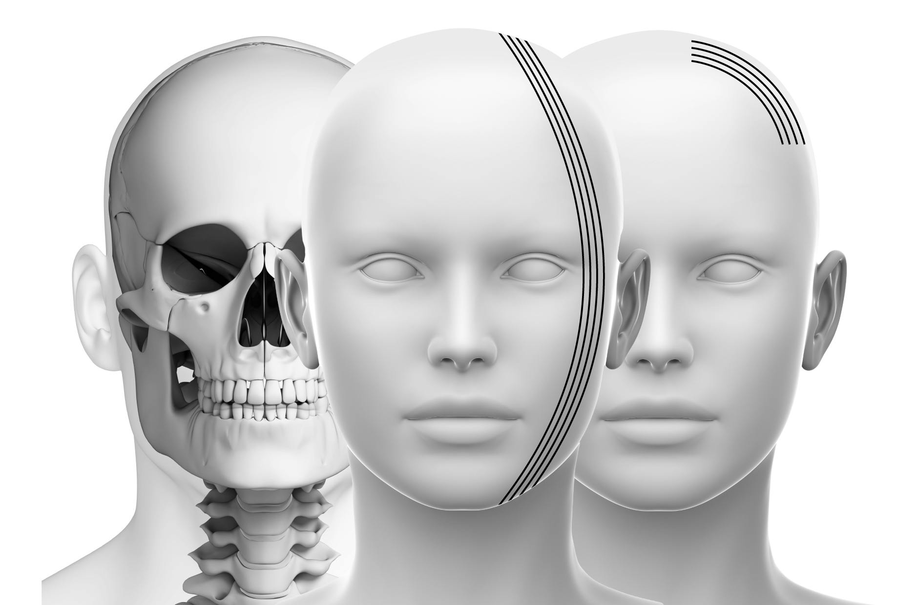
We developed a suite of detailed human head schematics, each one featuring graphic interpretations aligned with the specific anatomical insights that students would explore in each course.
This approach provided an engaging, visually rich way for learners to preview course content, highlighting core learnings in a clear and accessible format tailored to the needs of an international audience.
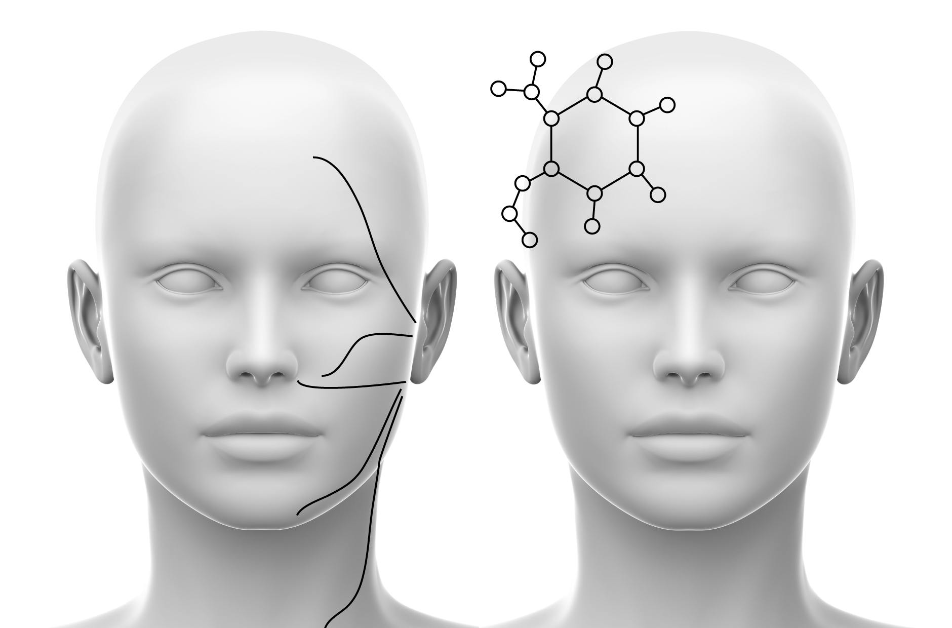
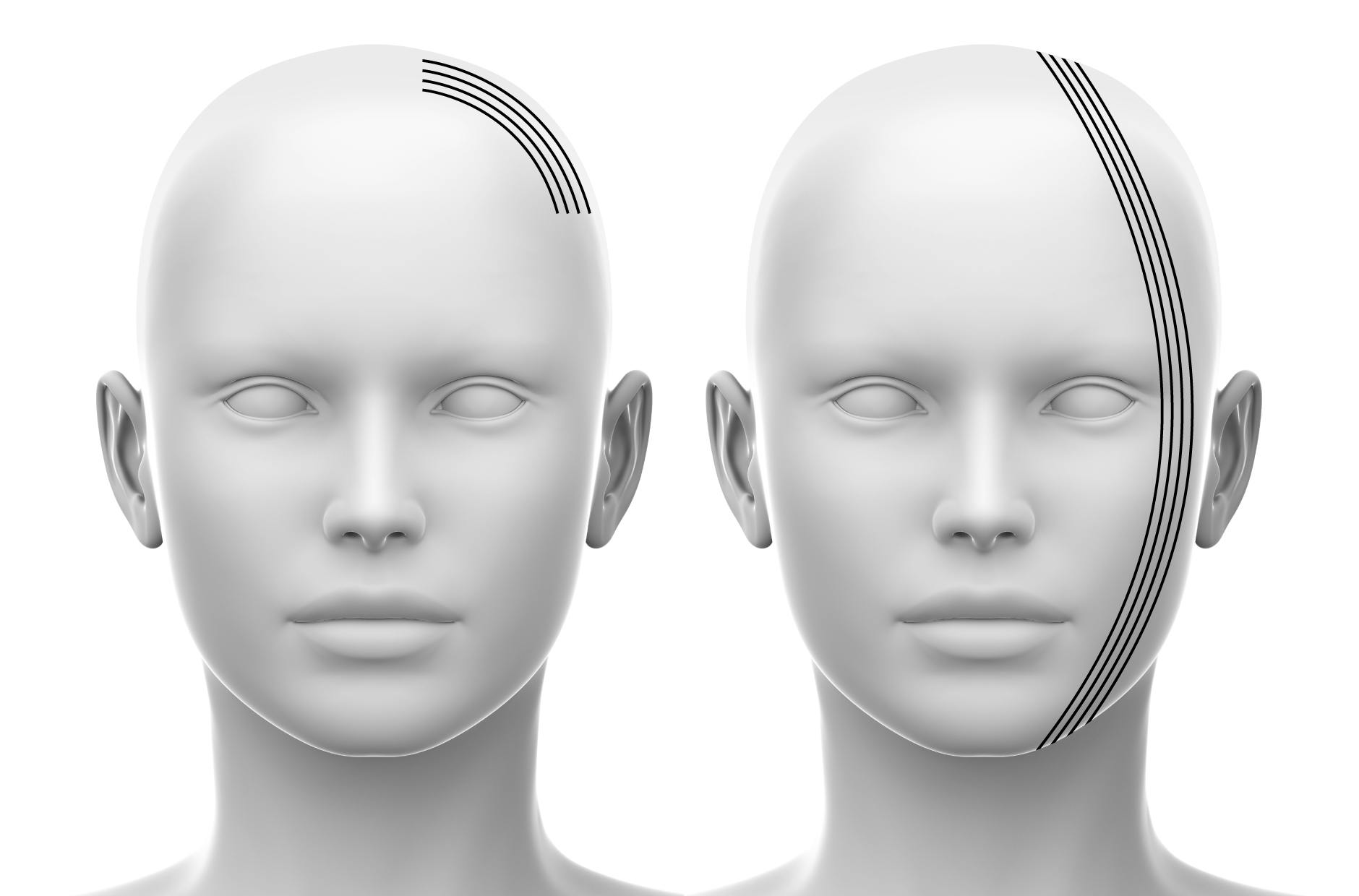
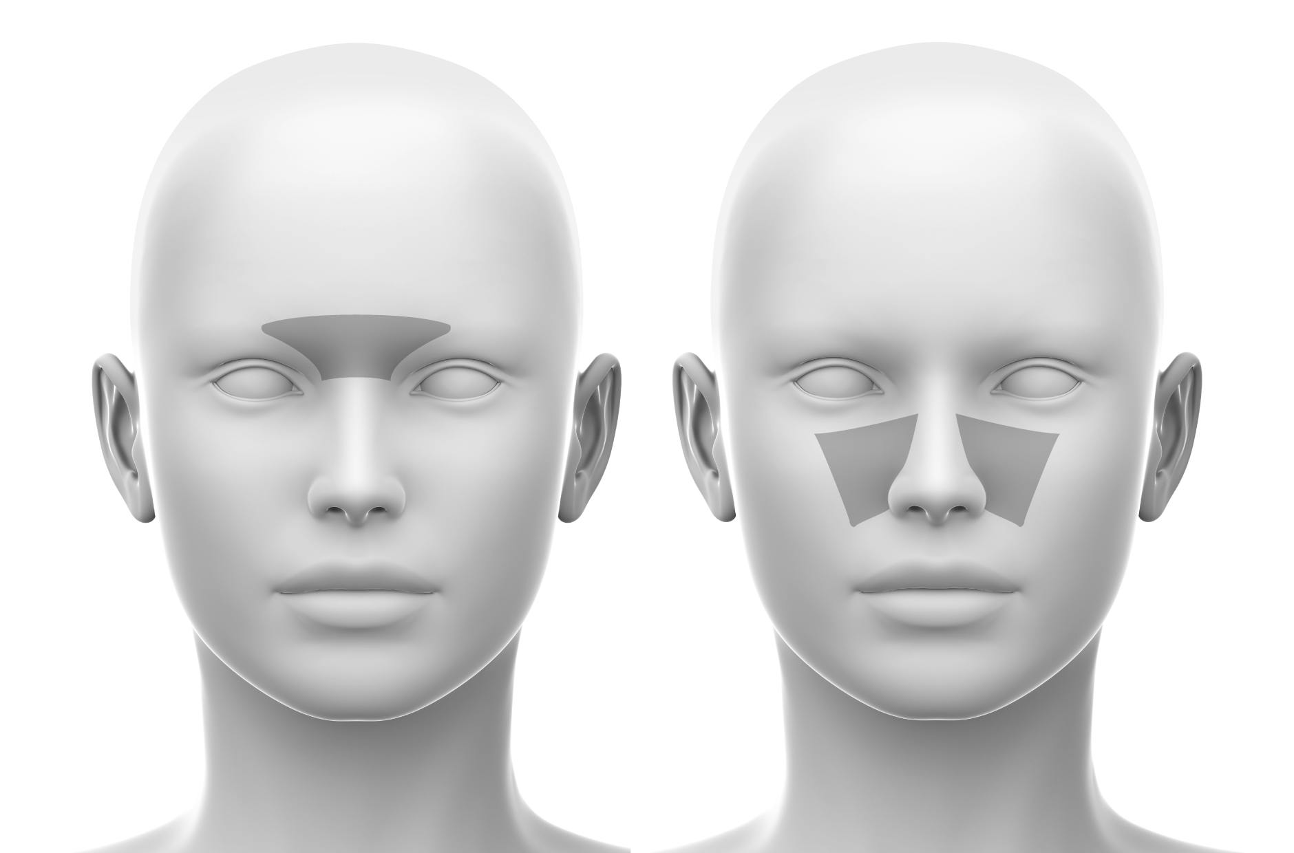
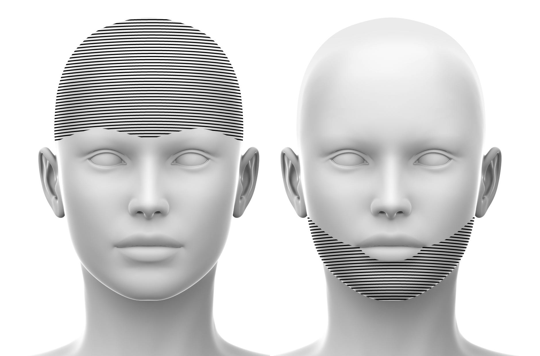
As we progressed with the project, the client expressed a significant gap in the anatomy field: a lack of structured guidance for professionals diving into this highly specialised education. Their commitment to supporting learners at every stage was clear, and they wanted the new website to reflect this dedication.
To address this, we created a feature called "Your Learning Pathway." This element took the form of an animated infographic, representing the learning journey as a pyramid with distinct stages. By visually mapping out each tier, we aimed to guide users seamlessly through their educational progression.
We strategically integrated this feature across key areas of the new website we were developing, ensuring it would be a valuable resource for learners navigating their professional growth.
The Website
The most intensive phase of this project was redesigning and redeveloping the client's website - a crucial transformation intended to drive the business forward and support its sustained growth.
Given the website’s role as the central touchpoint, it was imperative that we created a future-ready platform that could adapt with ease.
We chose to harness a Headless CMS approach, a cutting-edge solution that provides flexibility, enhanced performance, and substantial scalability to meet evolving needs. This system architecture equips the client with a highly responsive, agile website that’s ready to expand alongside their business.
In our design approach, we emphasised clarity and simplicity to make the customer journey through complex educational content as straightforward and manageable as possible. The resulting layout is clean, concise, and focused, helping users engage more intuitively with the information and resources they need.
Explore the live website by clicking here
With the successful completion of the project, our team has since formed a trusted partnership and now provides ongoing support, strategy, management and implementation of the client's marketing activities.
CLIENT WORDS
Matt and his team were very prompt in communication and stuck to all the timelines discussed. When my team needed something, they were quick to listen and help find solutions. We found Designmc had a very effective way of communicating with us.
Other Work
LET’S TALK
Looking to realign, refresh or redevelop your brand or business marketing strategy? Send us an email at hello@designmc.org or, give us a call direct on 01926 754038 for an informal chat.

