Branding | Brochures
The Brief
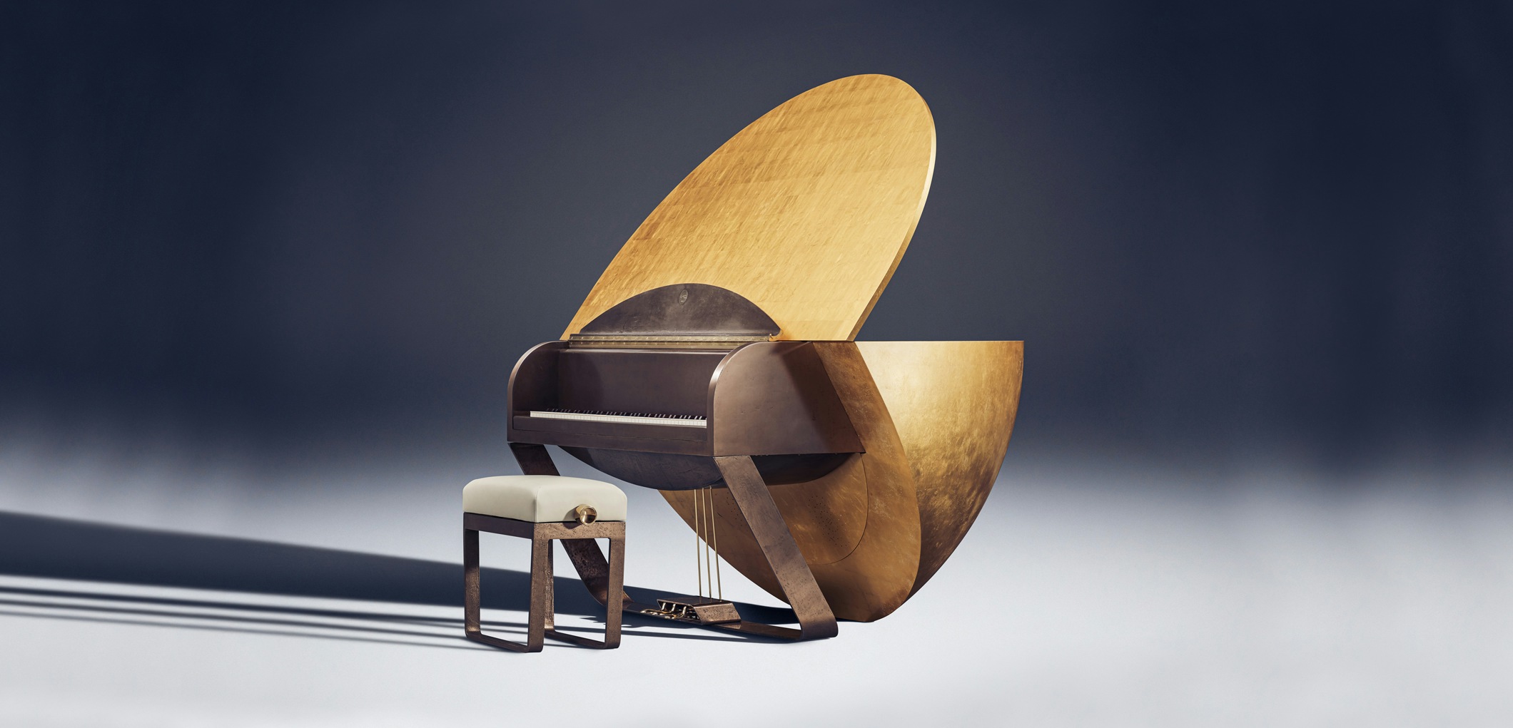
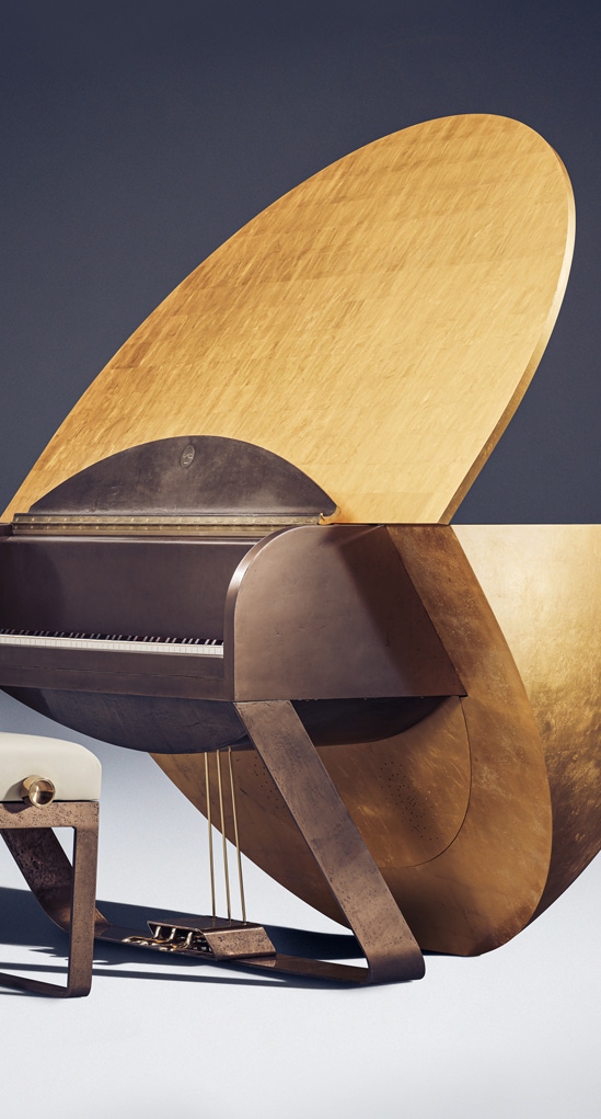
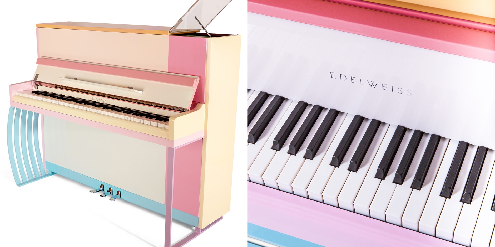
Edelweiss is a dedicated team of artisans who have been perfecting the art of custom piano making for over four decades. Yet, even the most prestigious brands require a refresh from time to time.
The team approached us with the ambition of wanting to evolve the brand, cohesively aligning the identity throughout the business, whilst preserving the brand’s authenticity.
The key characteristics that we were asked to take into consideration were its modernity, heritage and craftsmanship.
Our Approach
We started by dissecting the existing brand – by understanding what we had to work with, we could creatively piece together a solution that had a foundation of reasoning.
After doing research, we learnt that an Edelweiss is a mountain flower that grows in the high altitude of the Alps. With its elegant petals coloured white and buds of soft yellowy gold, we had discovered our brand palette.
Remaining conscious of modernity and the clients’ goal of evolving the existing brand, we looked at what defined the business – the pianos – this lead our thought process to the structure of the musical instrument and how we could combine it with the story of the flower.


Creative Development
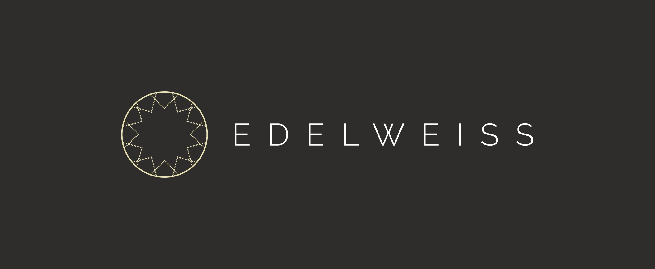
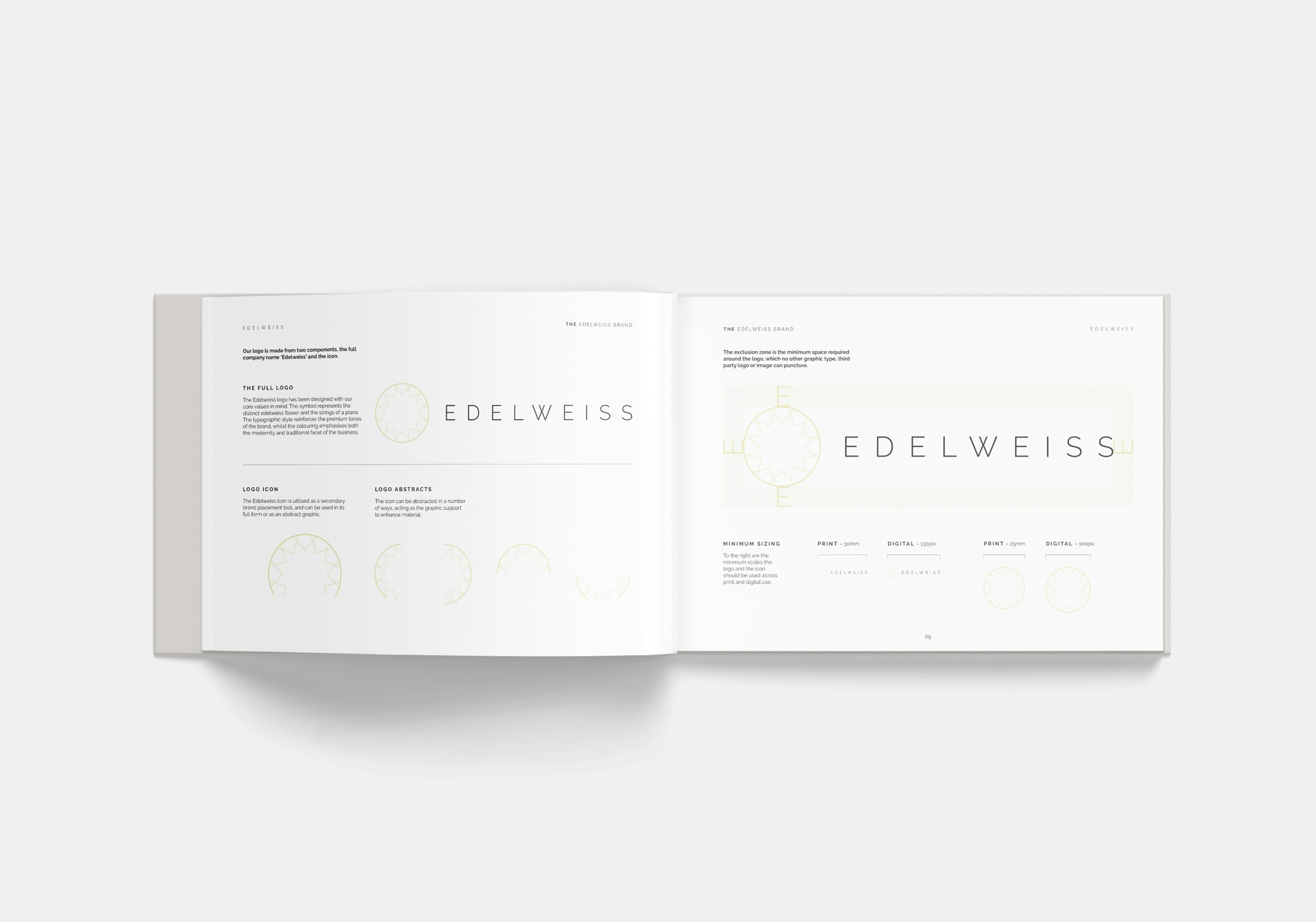
Using our research as inspiration, we developed a symbol that represents the story behind the brand – the flower head and the piano strings – with a style that compliments the existing contemporary brand identity. We felt it was important to capture the organic feeling of the flower within a simplistic icon solution.
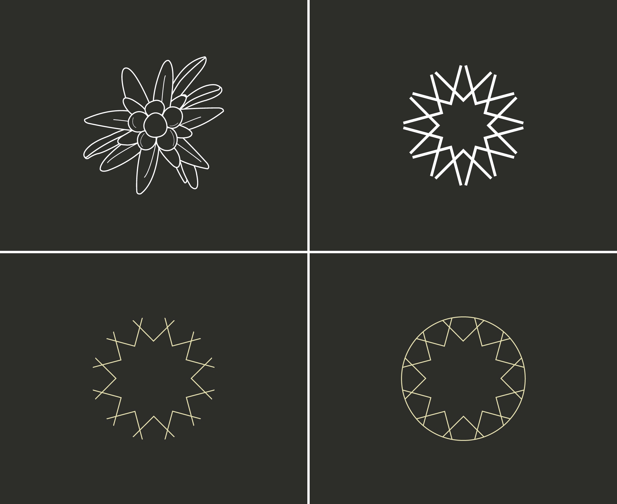
Pairing the symbol with the existing brand name elevates the visual presence of the brand as a whole. The symbol also enables the brand identity to be more expansive and flexible by offering its use as a standalone icon that represents the brand.
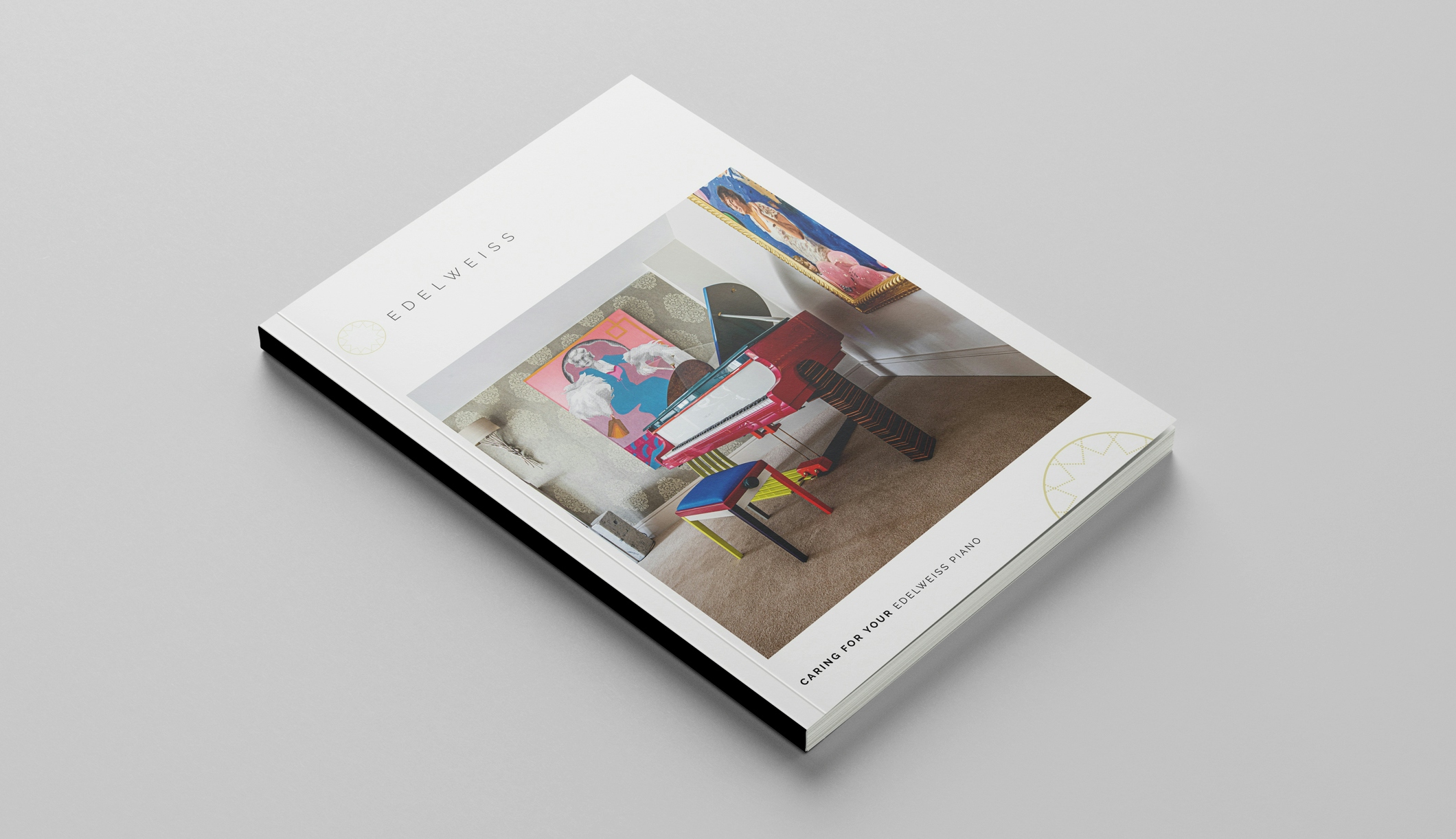
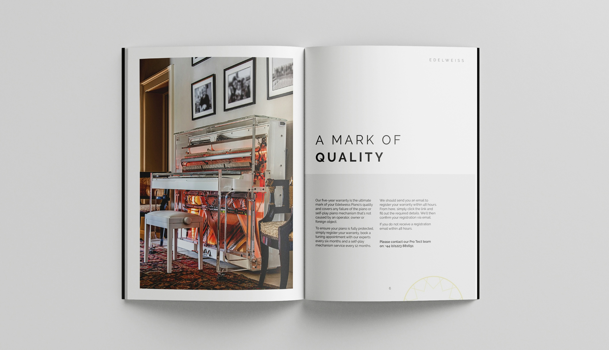
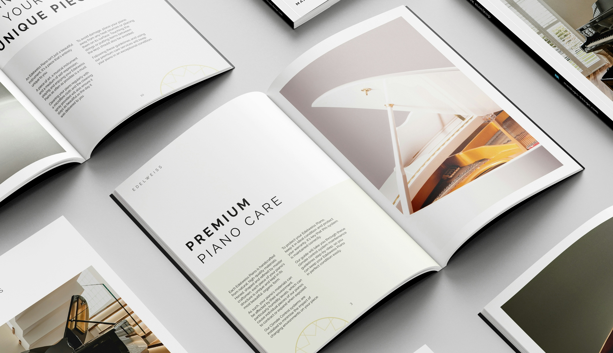
Solution
The evolution of the brand makes the identity more dynamic, more distinct and more memorable to the end customer – ultimately elevating its market position.
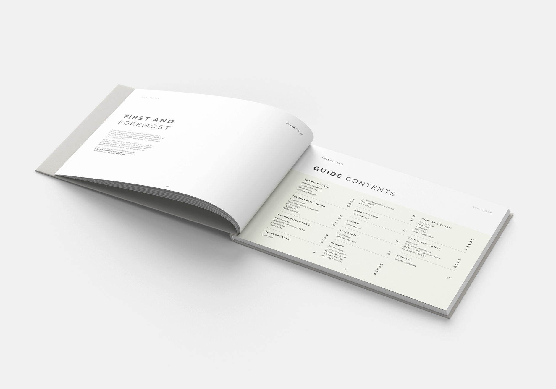
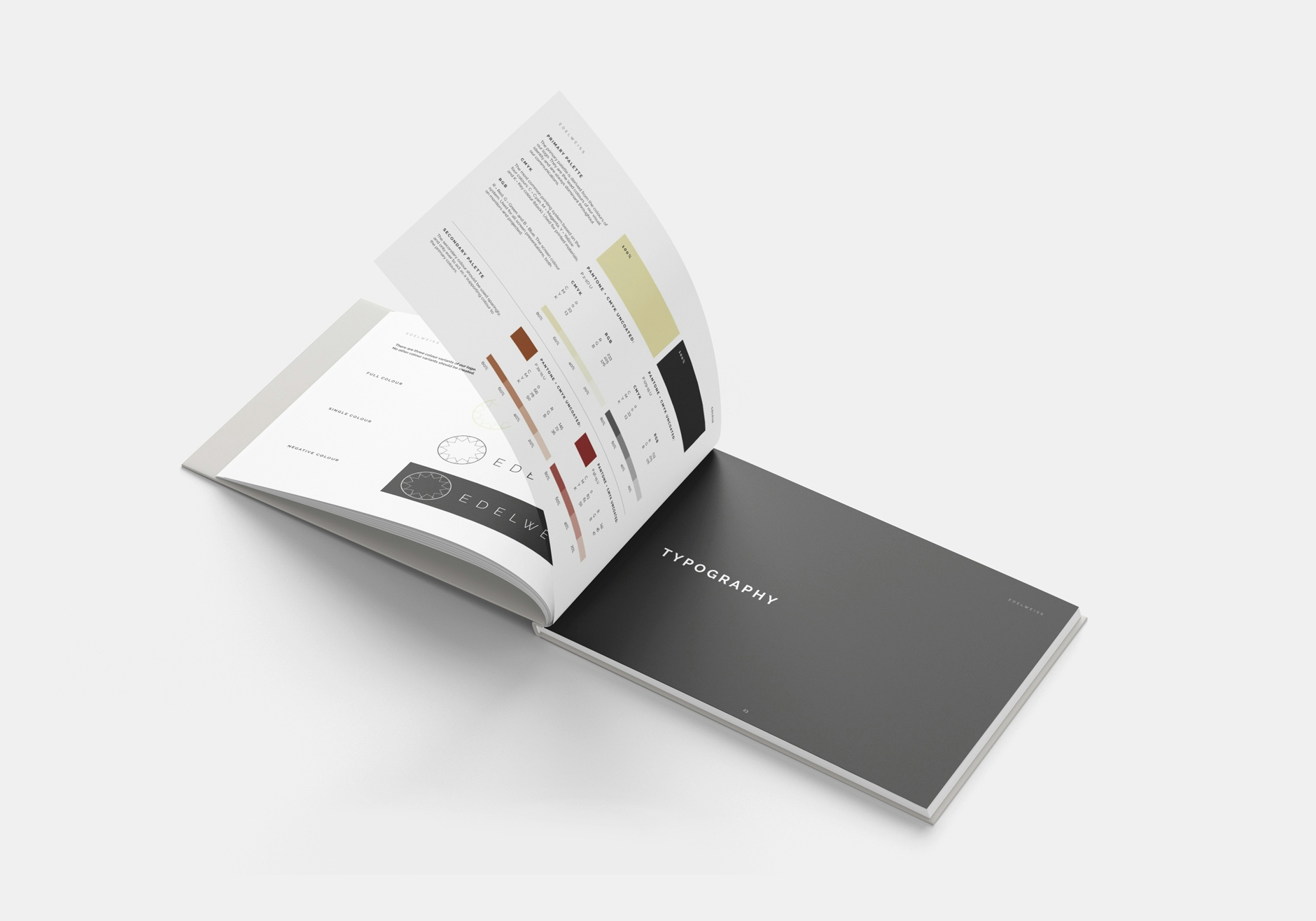
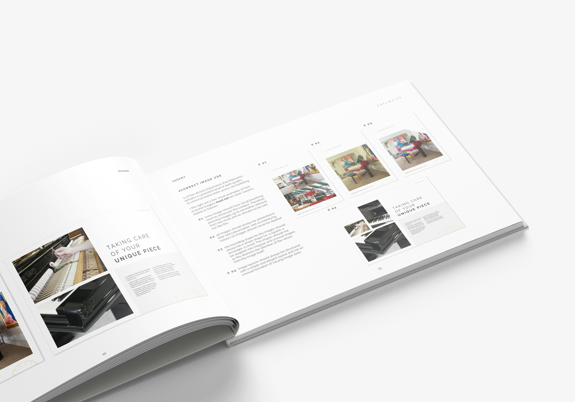
With the rebrand complete, we set out to create a comprehensive brand guidelines that future-proofs its consistency of use across all touch points of the business and its sub-brands.
With the new branding complete, we developed a mini brand guidelines document to outline the usage rules of the brand to ensure it's correct use and consistency in the future.
Other Work
LET’S TALK
Looking to realign, refresh or redevelop your brand or business marketing strategy? Send us an email at hello@designmc.org or, give us a call direct on 01926 754038 for an informal chat.

