Brand Naming | Branding | Animation


The Brief
Equipal, formerly Equipment Connect, is a long-standing client who we have been on the brand journey with since it was established.
The client recognised that the equipment finance and management industry was seeing a big shift, with the rise of competitor brands and a change in market expectation. Their team determined that it was time to revisit and evolve the brand.
With the business already boasting a unique-to-market digital platform, they set out with an ambition of reforming the brand name to give the business a new distinction in the marketplace – one that captures their USPs and communicates directly to the customer.

Our Approach
It was a paramount stipulation that the new brand had to retain an expression of the clients’ three-sided marketplace. This element is a direct reflection of the digital platform that the business provides to its customers, and so had to play a key role in the brands identity.
We begun the process by working closely with the clients team to understand, extract and define what fundamentally distinguishes the business from their competitors.
After lots of deliberation and discovery work, it was agreed that the new brand name needed to strike a fine balance of having a personality that engaged – and appealed to – the target customer, whilst also maintaining a clear understanding that this is an equipment-based finance service.
Creative Development
Once we had thoroughly examined and determined the businesses core values, differentiating factors and unique tone of voice, we explored naming solutions.
Remaining mindful of such factors as; being catchy and easy to pronounce, being memorable and engaging, being modern and tech focused – we explored brand name ideas that captured the business in a succinct and relevant way.
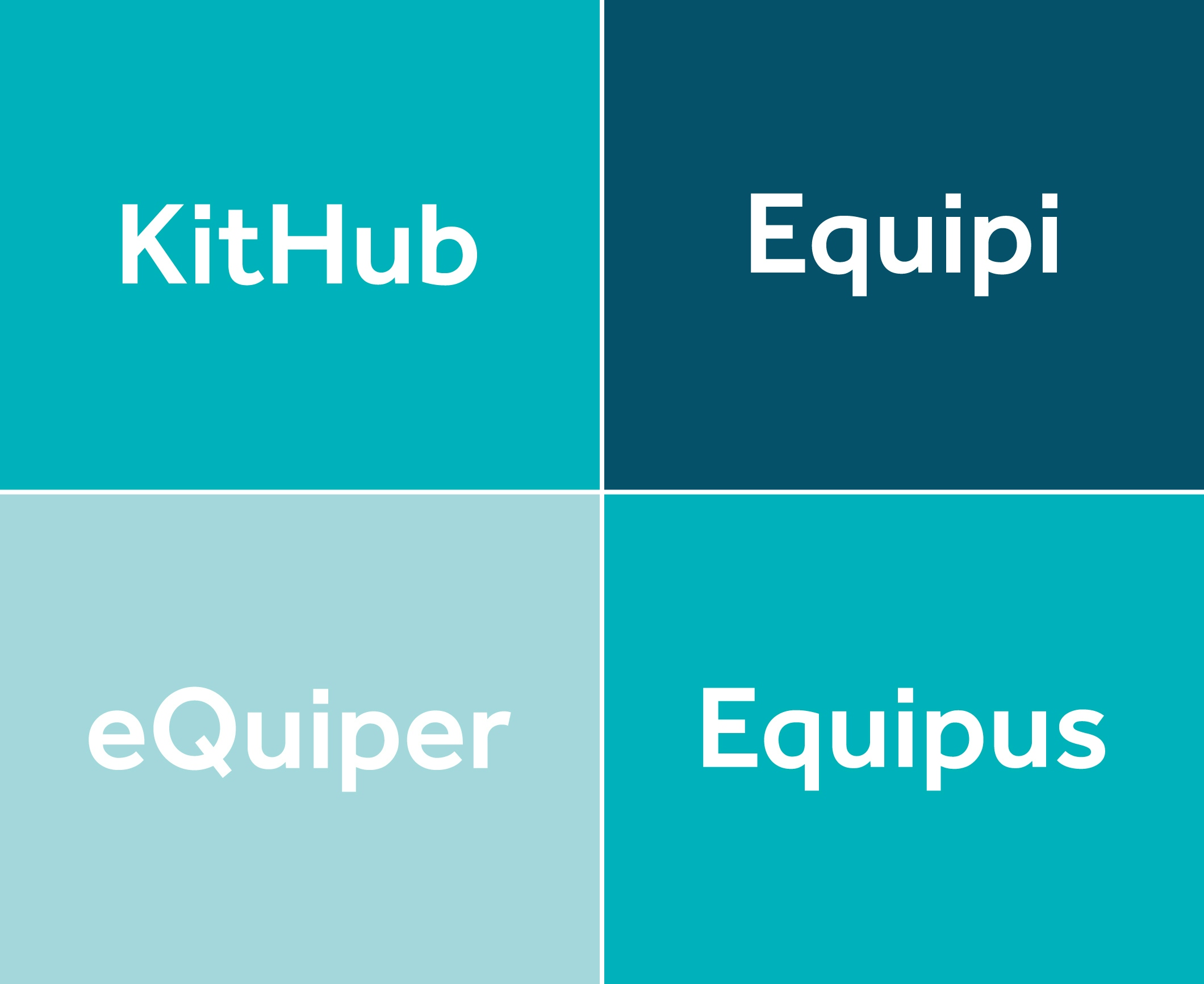
After some extensive name exploration, we discovered the solution that compacts the right tone of voice and personality for the client’s target audience, whilst retaining the foundation of their service.
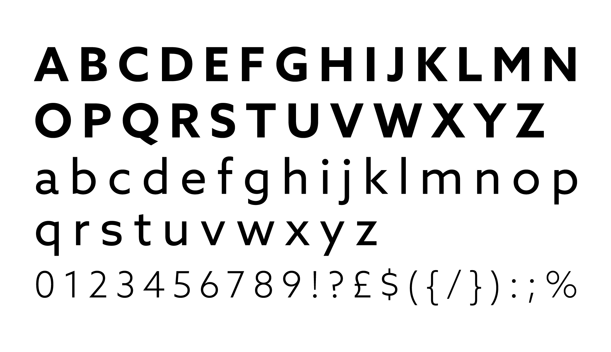
We also considered the choice of font type used, to assure we conserved the distinctiveness of the new brand – both verbally and aesthetically. Further to that, we felt the logo word should be in lower case format to amplify the personable and communicative tone.

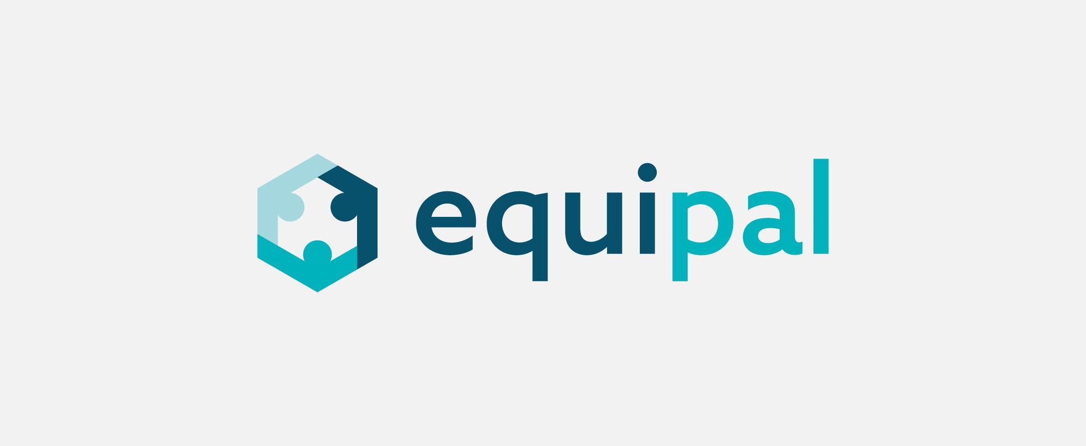
Next, we switched our focus onto creating a symbol that sat alongside the brand name to represent the businesses three-sided marketplace that formed the basis of the client’s digital platform.

After exploring a range of potential creative solutions, we came up with a symbol that conveyed a number of qualities, including; the three-sided marketplace, the element of person-to-person interaction within the platform, and a mechanical/equipment tonal quality.
Solution
The new brand reestablishes the business as a leader within the market space, and is one that presents an individual voice that is cohesively reflective of the business values, vision and service.
To promote the relaunch of the brand, the client asked our team to create a short animation, giving the audience a snapshot of the service and the businesses unique platform, culminating in the reveal of the new brand.
Other Work
LET’S TALK
Looking to realign, refresh or redevelop your brand or business marketing strategy? Send us an email at hello@designmc.org or, give us a call direct on 01926 754038 for an informal chat.

