Branding | Website


The Brief
Planning Insight are a dynamic town planning consultancy based in Central London. Established in 2009, the business has experience and expertise in a number of planning industry sectors including residential, mixed use, education and infrastructure.
The firm approached the agency to help develop and move the brand forward, to better align brand perception with the distinctive business ethos of providing a tailored approach to the service it provides.

Our Approach
Our thought process began by looking at the core services the business offers and the various sectors within the planning industry in which they are applied.
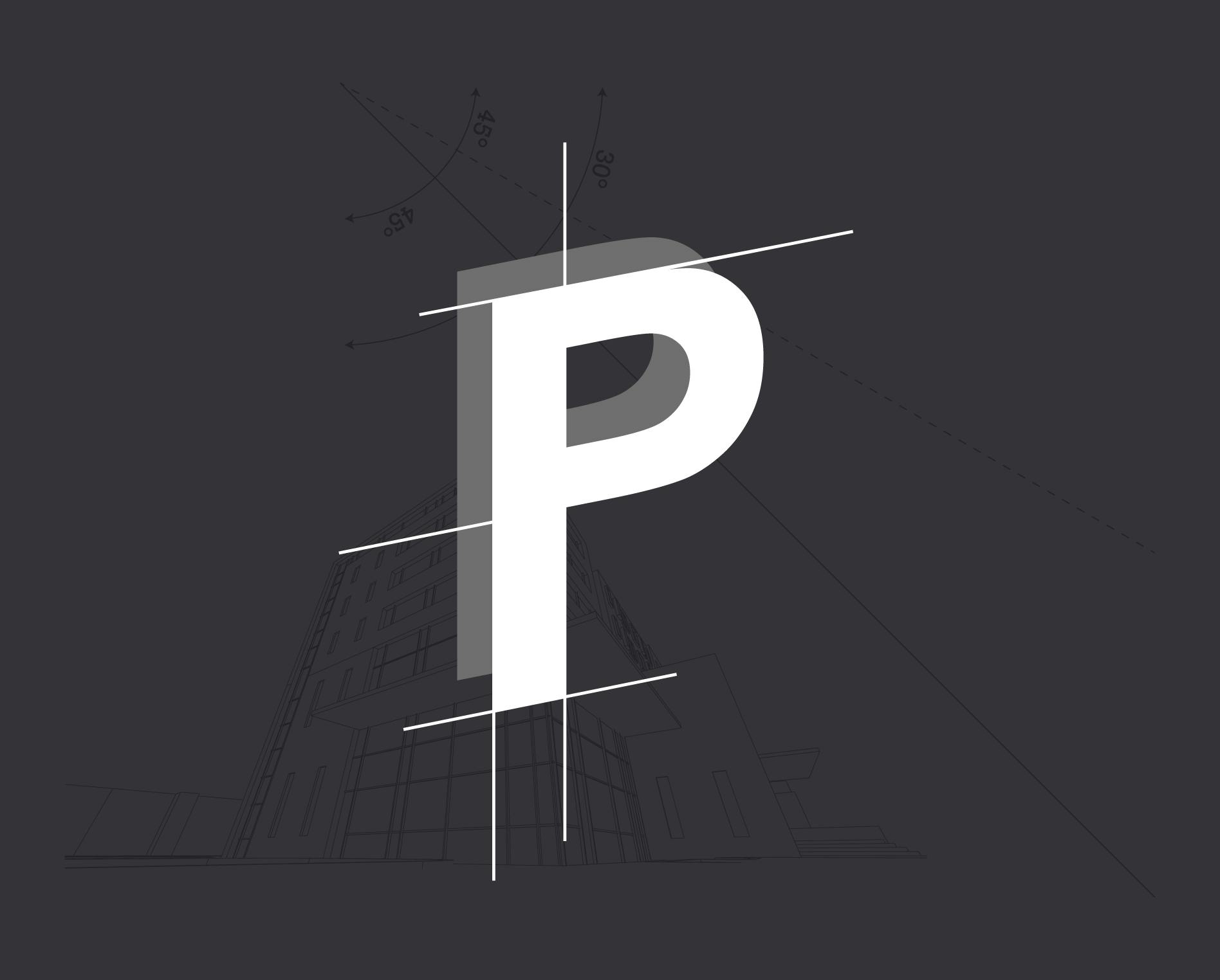
With the knowledge in place, we proceeded to explore how we could incorporate the broad scope of the services, captured into a singular symbol that tied back to the brand name.
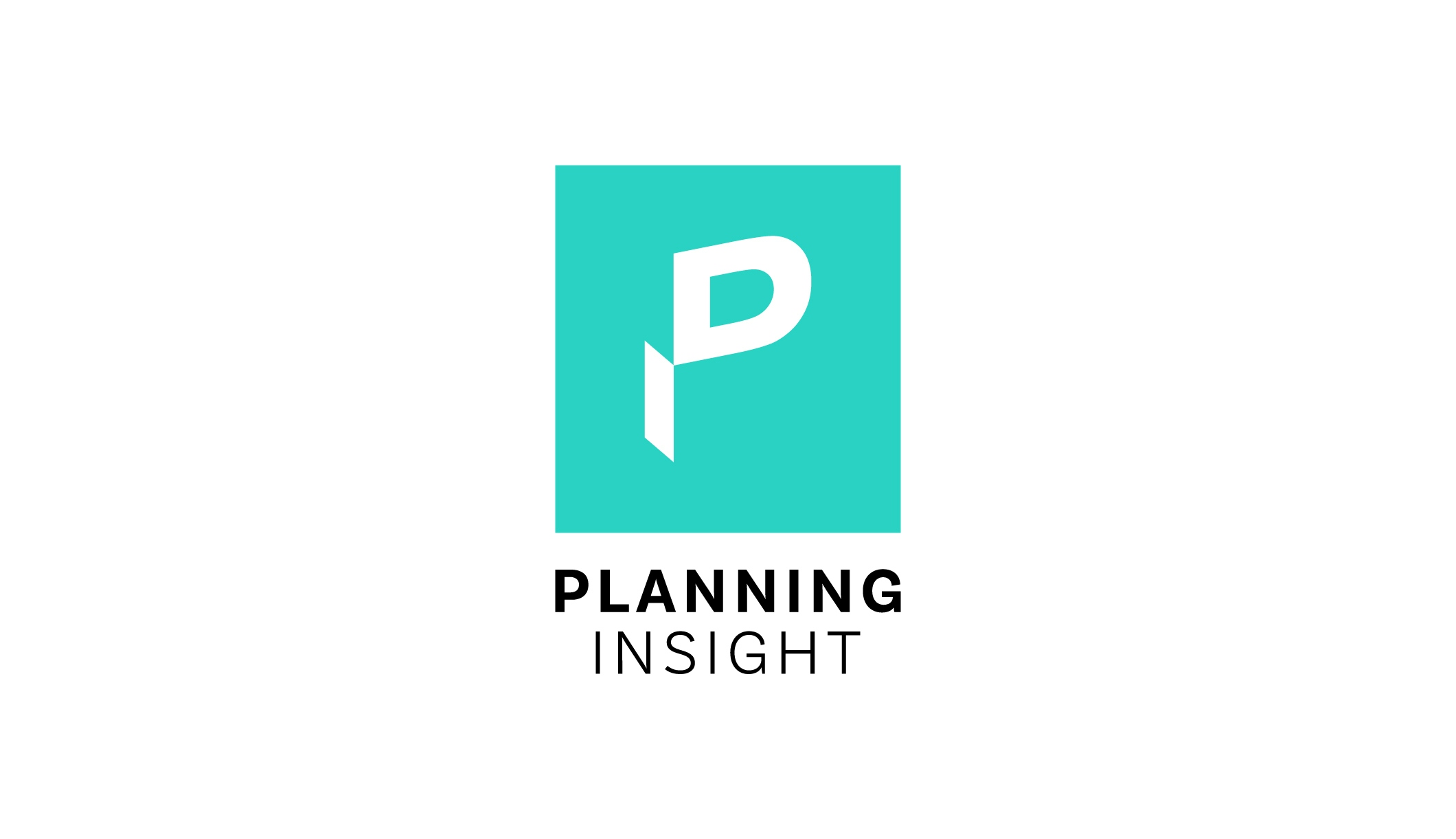
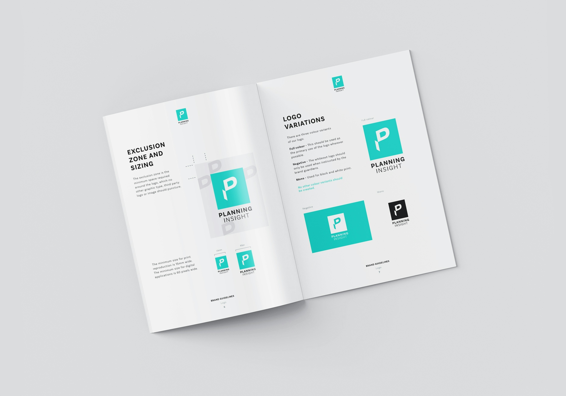
Our solution is an abstracted three dimensional symbol formed from the letter ‘P’ and, using white space, the corresponding elements represent the starting letters of the business name (P and I). The approach of utilising perspective reflects the architectural and observatory nature of the business services.

Creative Development
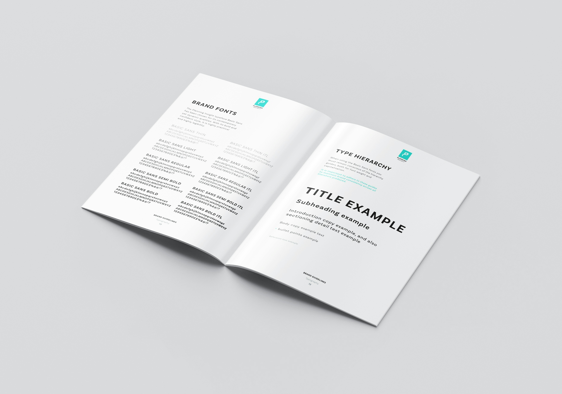
With the logo symbol created, we expanded the brand identity by defining the font type and colour palette. It was important to maintain a sense of modernity, selecting a simplistic font and vibrant colour, to ensure an association with the businesses forward thinking practises.
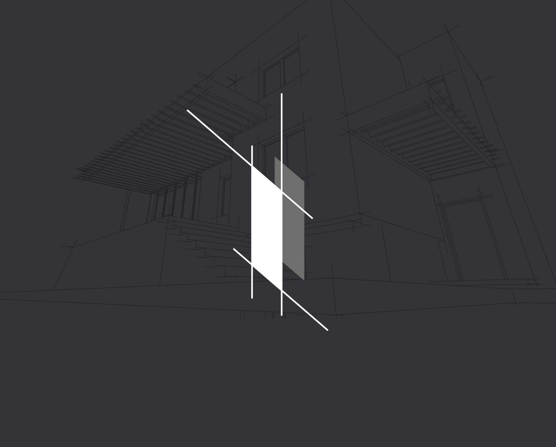
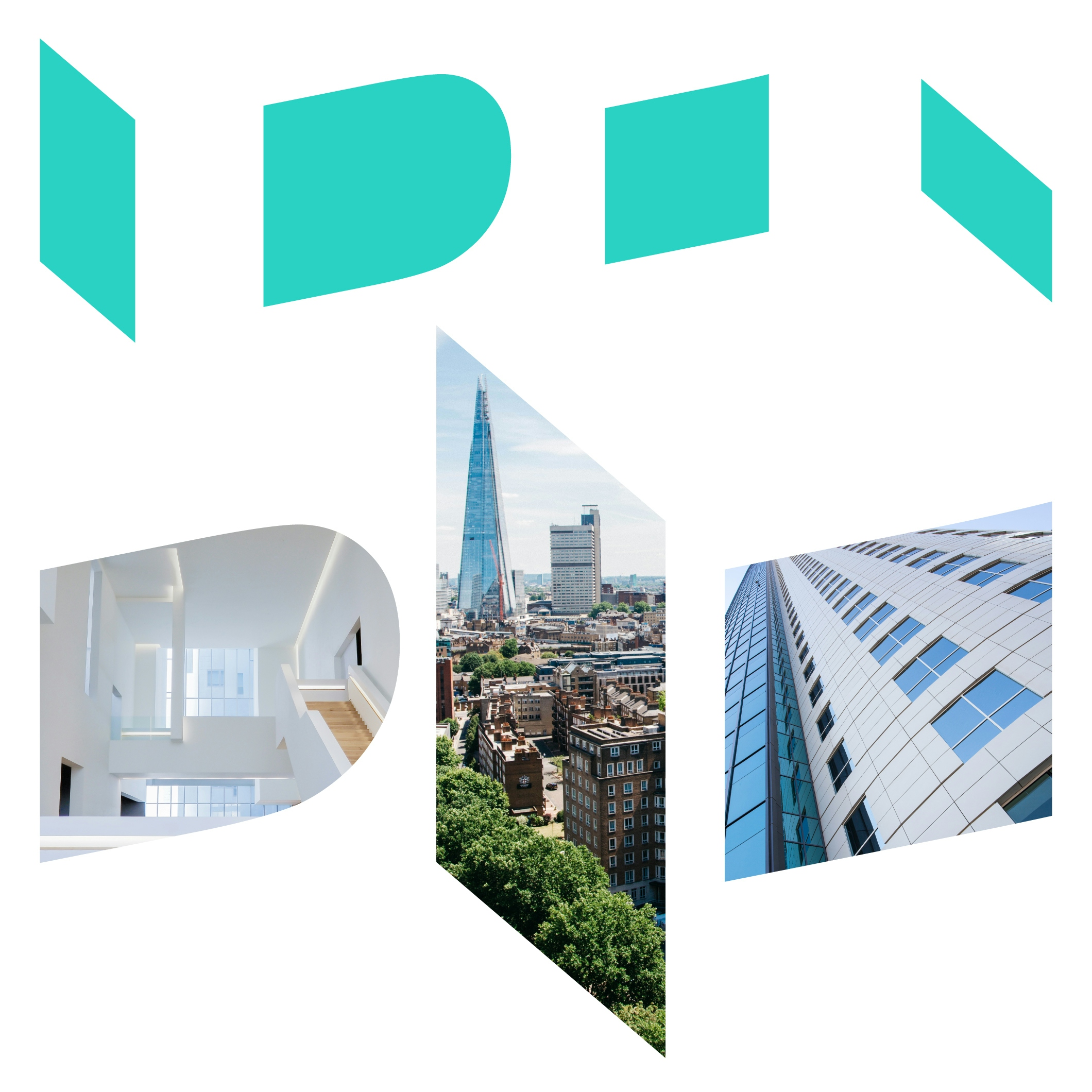
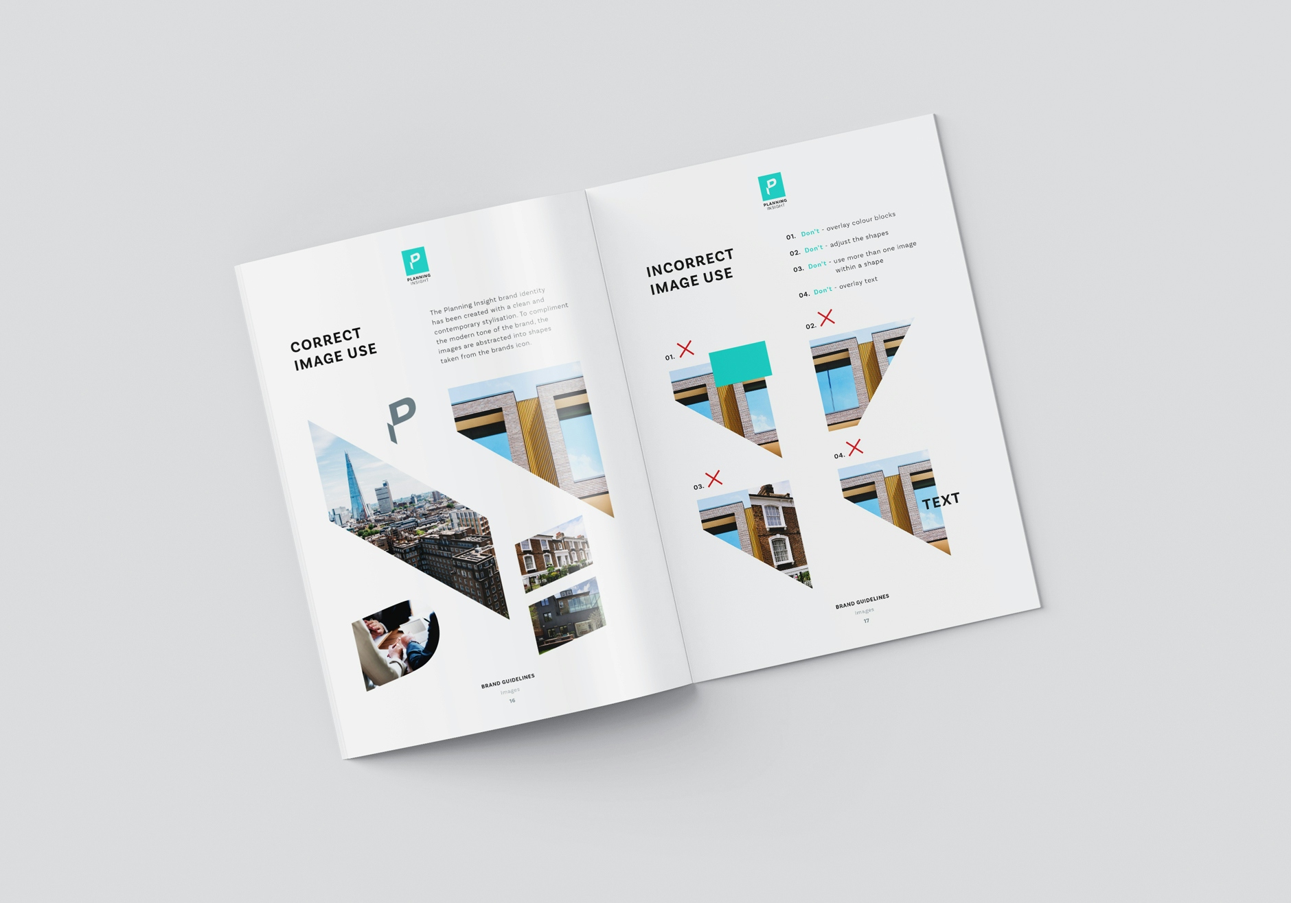
Utilising the symbol we had created, we extracted shapes from it and converted them into a graphic language. The intriguing image containers capture audience attention and strengthen the familiarity of the brand.
The expanded identity provides a unique versatility to the brand, positioning the business in the market with an individuality.
With the rebrand complete, we created a brand guidelines document that outlines the elements of the brand identity and its usage. Having this document in place enables the clients team to maintain a consistency with any future use of the brand.
In the second phase of the project we were asked to design and build the companies website, advancing the digital presence of the business.
With the new brand identity being relatively eccentric for the industry sector, we acknowledged that the design of the site needed to showcase the distinctive brand within a polished and more conventional site structure.
Solution
The new website presents the business in a clean and concise way, one that utilises the brand elements as visual guidance to signpost the user to key content and actions points.
With the brand being used in this considered way, the overall website solution is visually manageable yet retains the distinctive characteristics that stand the business up against competitors.
Since its launch, the business has worked on the HS2 project, as well as attracting a multitude of large development projects across London.
CLIENT WORDS
"As a long standing agency for us, the team at designmc really are an extension of the marketing department. As well as fulfilling ad-hoc requests, the team support in key projects such as; brand development, internal and external reports, and important presentations. They understand our business, and often they go the extra mile."


LET’S TALK
Looking to realign, refresh or redevelop your brand or business marketing strategy? Send us an email at hello@designmc.org or, give us a call direct on 01926 754038 for an informal chat.